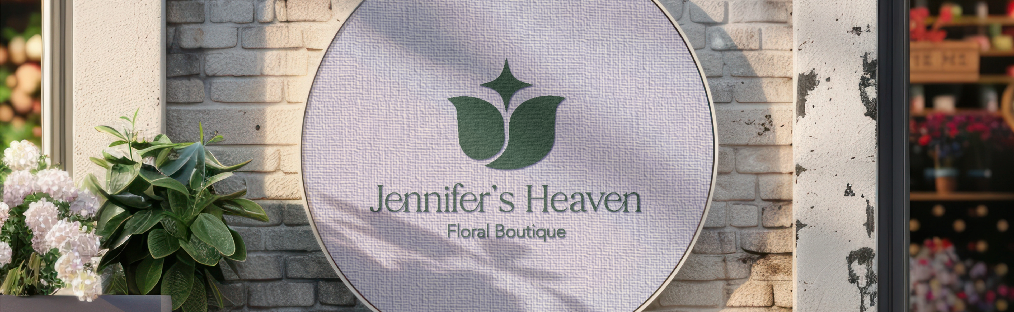
Jennifer's Heaven is a conceptual high-end independent boutique flower shop dedicated to creating dreamy, delicate floral arrangements with a soft and feminine touch. Based in the U.S., the client sought a brand identity that conveyed a sense of one that would reflect the gentle beauty of her floral work while standing out. The goal was to develop a cohesive stationery suite and logo system that captured this ethereal atmosphere.
TOOLS USED: Adobe Illustrator, Adobe Photoshop, Procreate
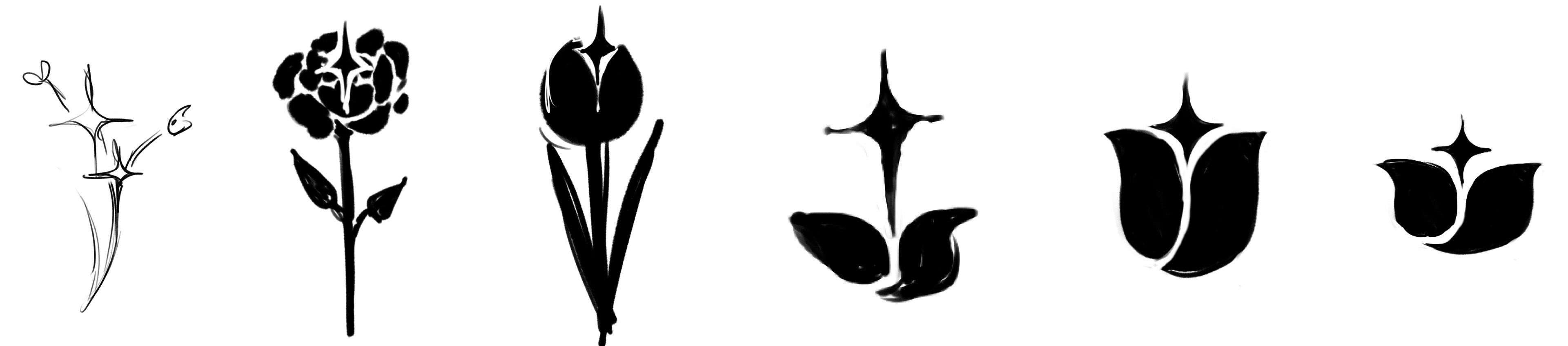
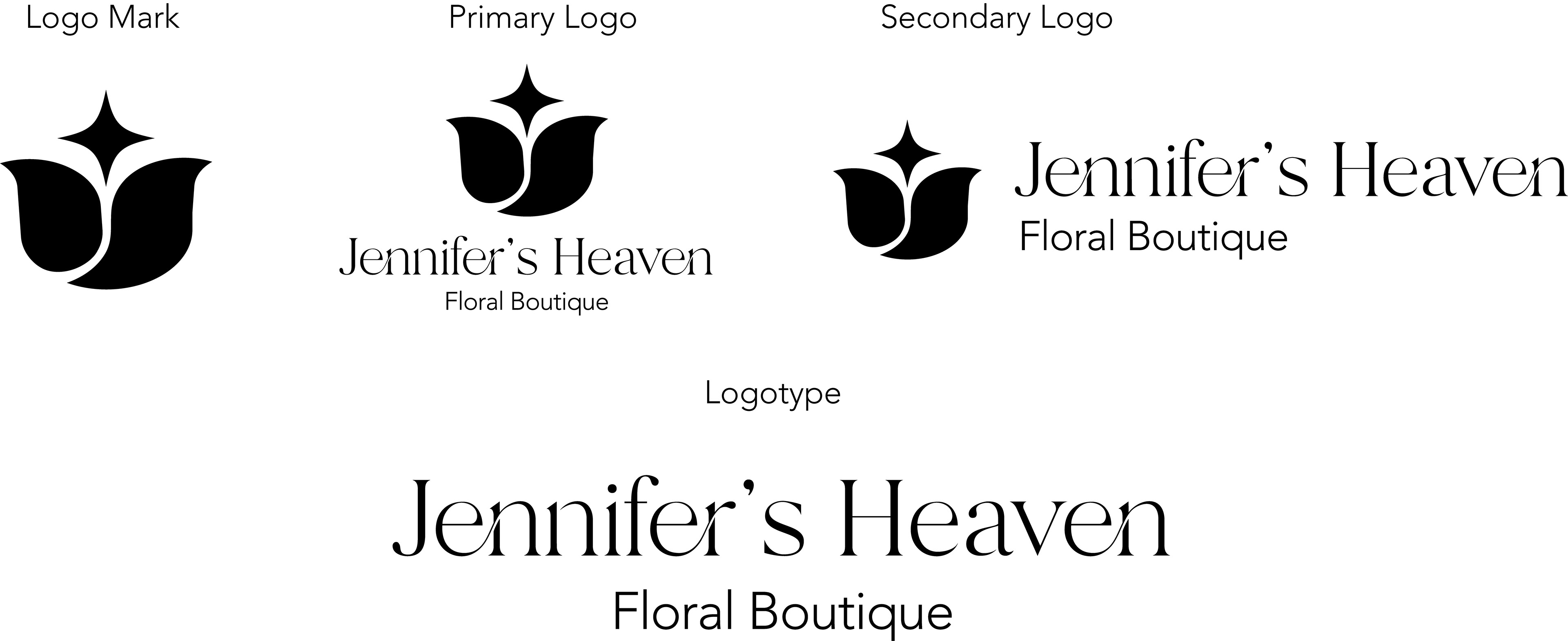
Logo Sketches | Rasters
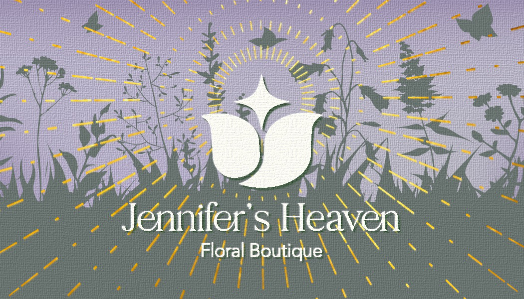
Early concepts explored a flower paired with a star, symbolizing both natural beauty and a heavenly touch. The symbolism of a star reflecting a bit of heaven while making sure a floral piece was the main event reflects the brand’s name and helped shape a visual identity that feels graceful, divine, and boutique-worthy.

Logo Vector
The final logo combines a stylized floral mark with a star motif, which captures the aspect of heavenly aspect while remaining high-end with its clean simplicity. I wanted to incorporate not just the feeling of organicness from the tulip, but also a super subtle personalization of Jennifer, which is reflected in the letter "J" in the negative space.
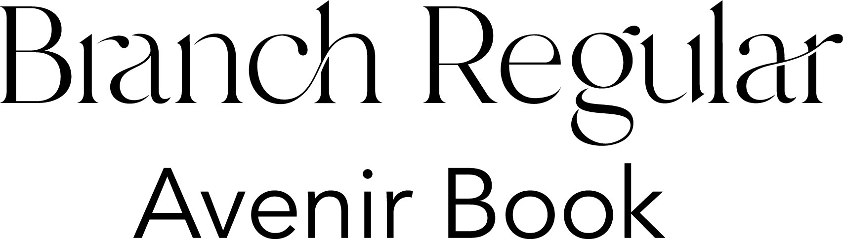
Typography
For the logotype, I selected Branch Regular for its graceful curves and botanical elegance. The high-contrast strokes and delicate terminals echo the organic forms of petals and vines, subtly evoking nature without overwhelming the design. This refined serif captures the boutique’s upscale, heavenly essence while adding a modern, luxurious feel.
To complement it, Avenir Book is used for the supporting descriptor, Floral Boutique. Its clean geometry and contemporary clarity provide a quiet contrast, grounding the brand with a sense of legibility and professionalism. Together, the pairing reflects the heart of Jennifer’s Heaven: a balance of romantic florals and elevated sophistication.
Final Logo Iterations
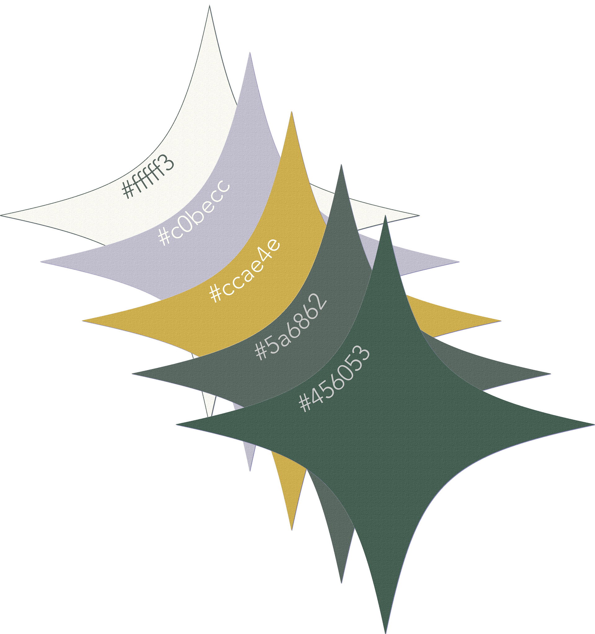
Color Palette & Texture
This palette blends soft elegance with grounded luxury. The sage green (#456053) and buttery ivory (#fffff3) create a calm, refined foundation, while lavender-gray (#c0becc) adds a dreamy, ethereal touch. Supporting shades like muted gold (#ccae4e) and cool slate (#5a6862) bring warmth and depth, echoing the boutique’s heavenly floral atmosphere with a sophisticated glow. The decision to add subtle canvas texture that overlays the brand elements adds a soft, tactile quality that enhances the organic, handcrafted feel of the identity.
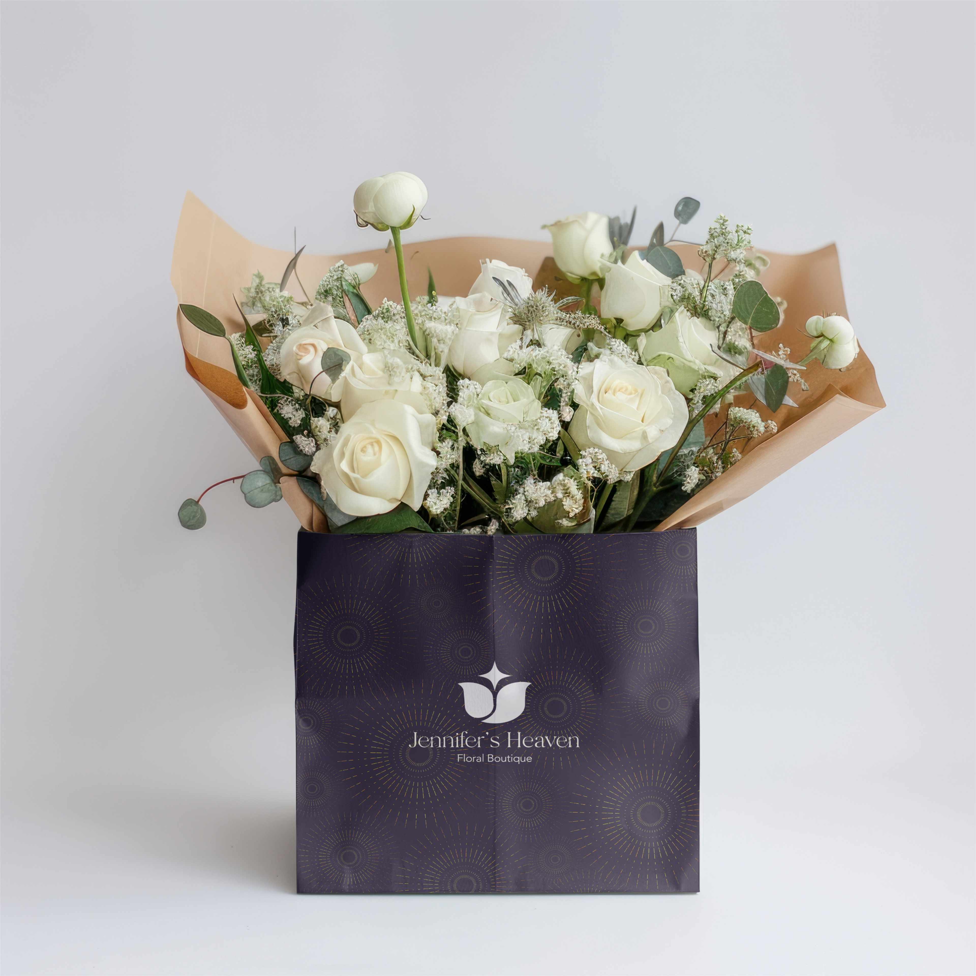
Radial Pattern Packaging
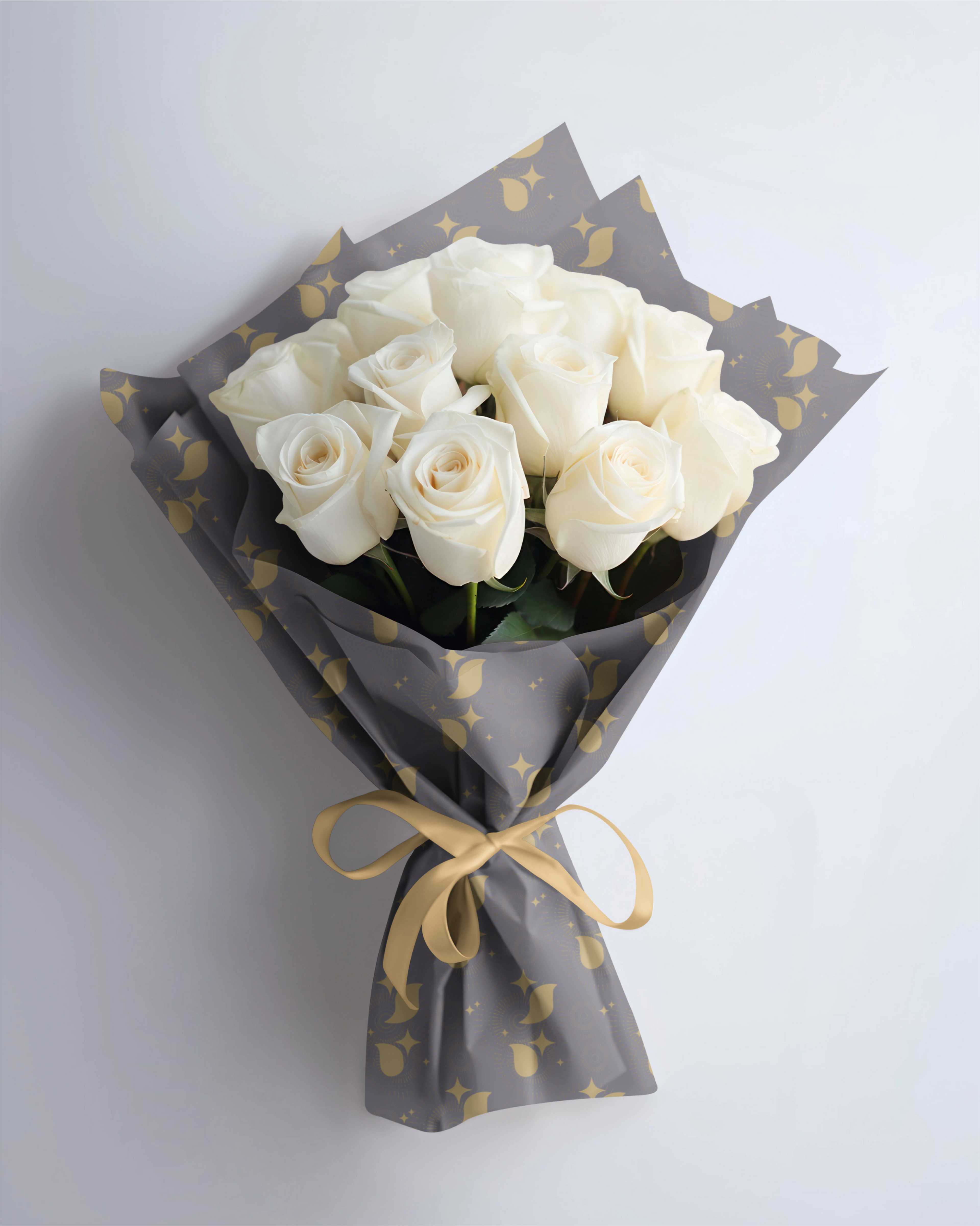
Logo Motif Wrap
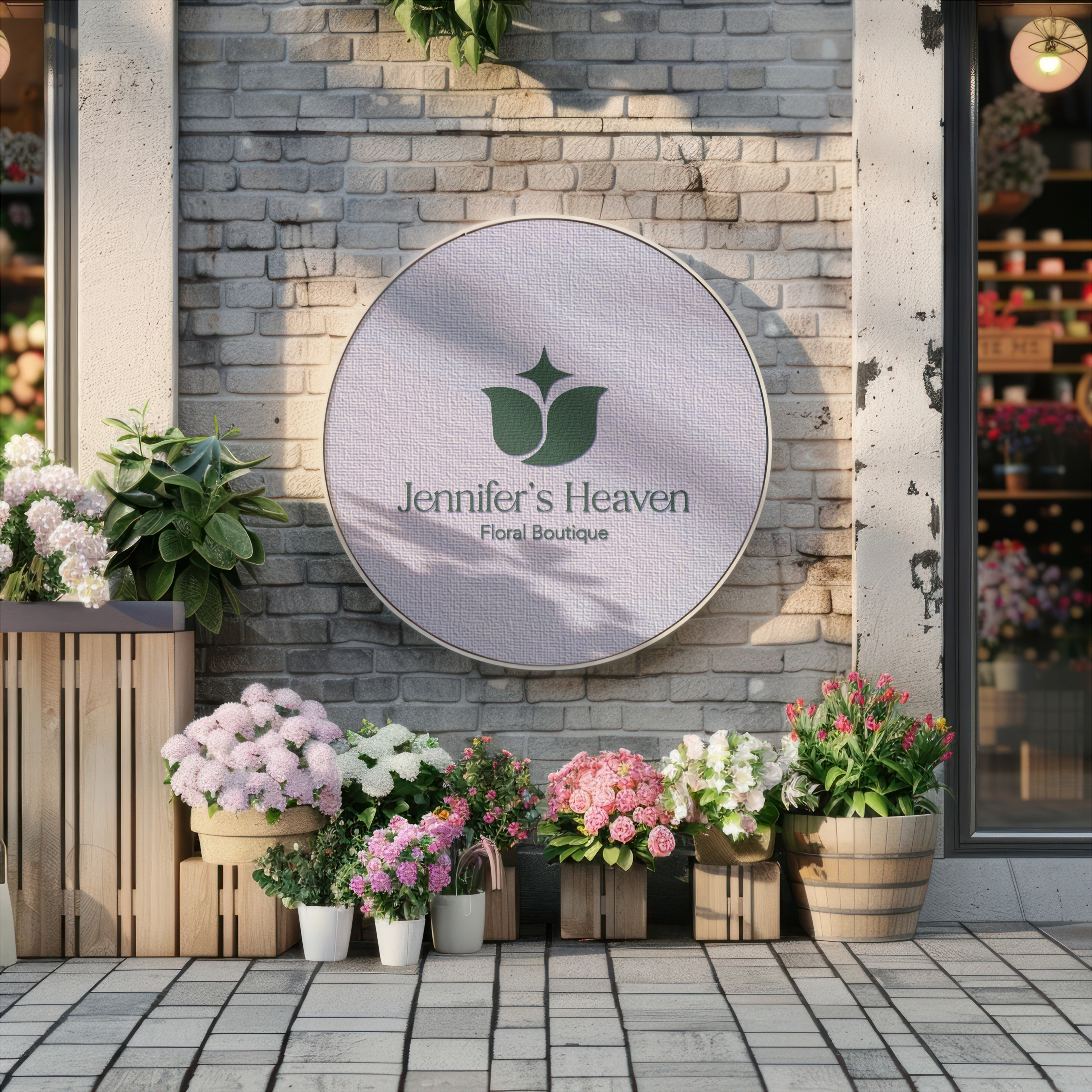
Primary Logo Display
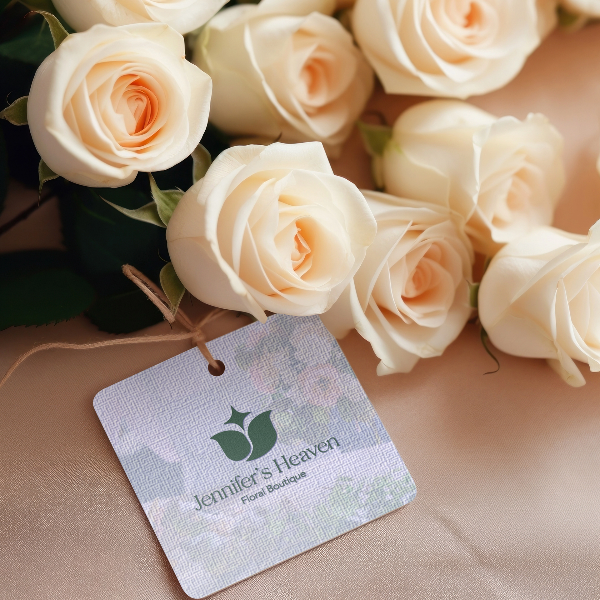
Primary Logo Display 2
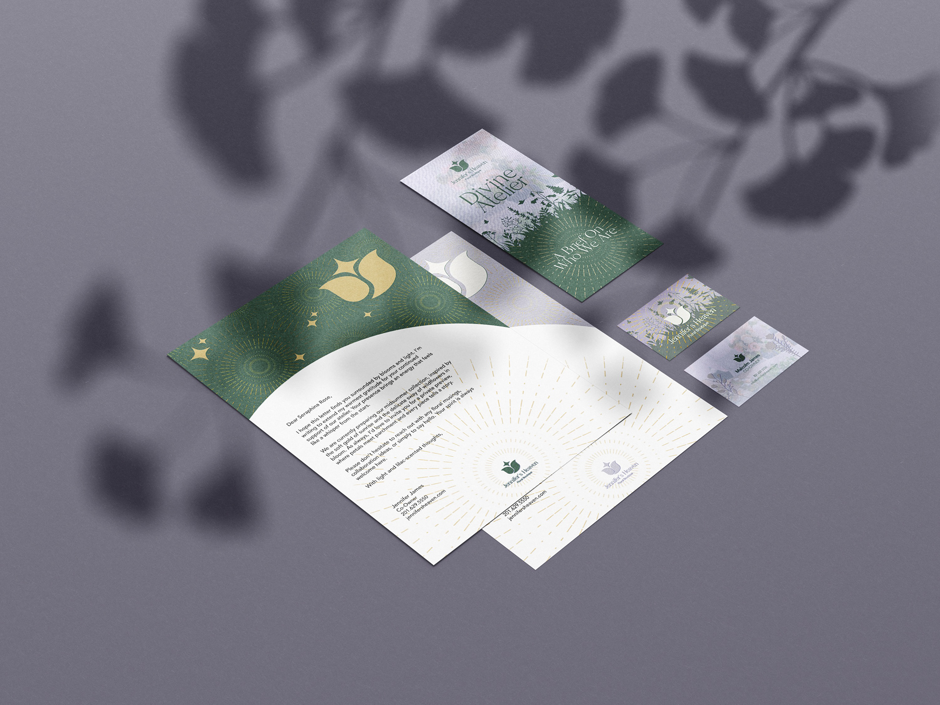
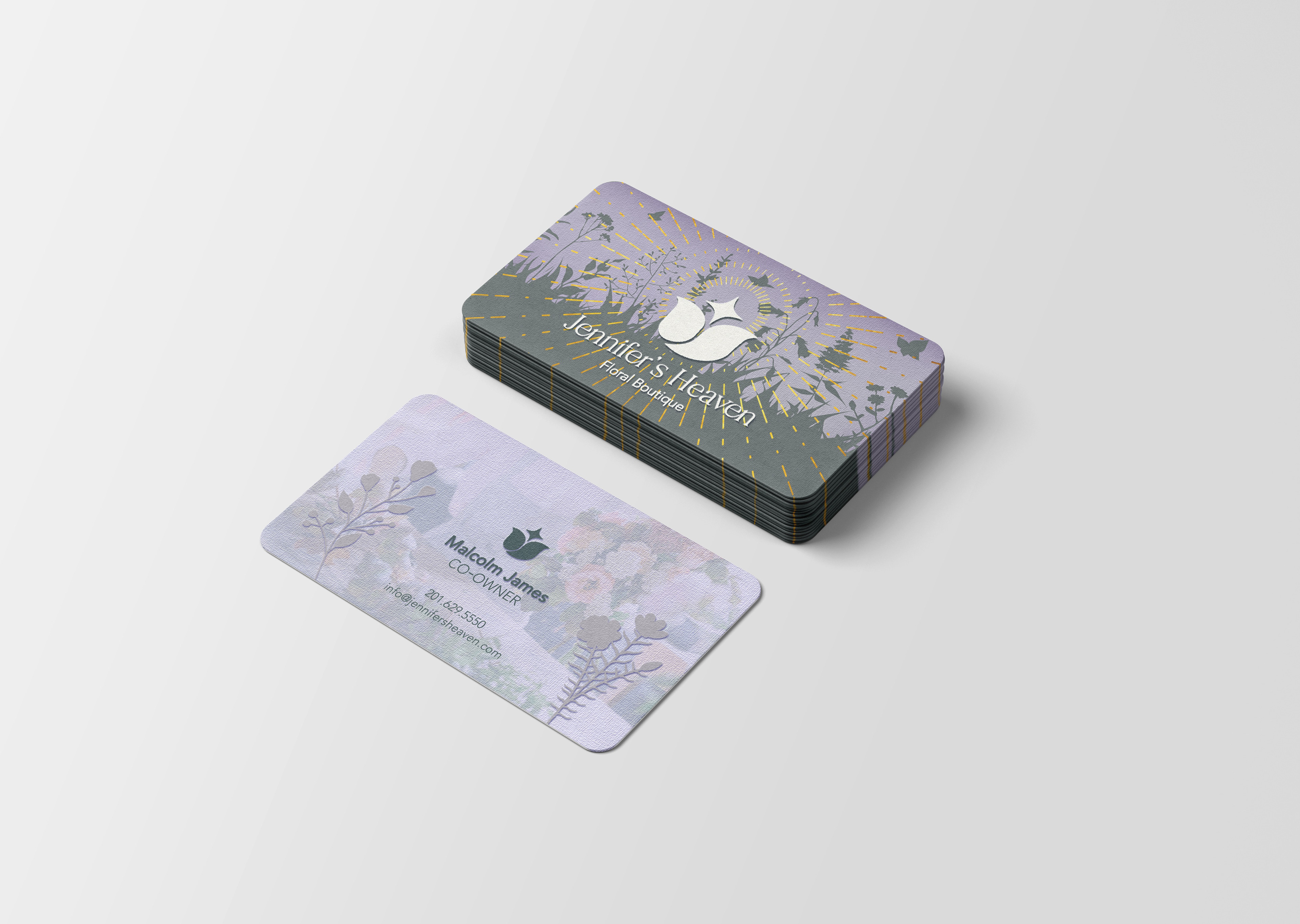
Stationery Suite
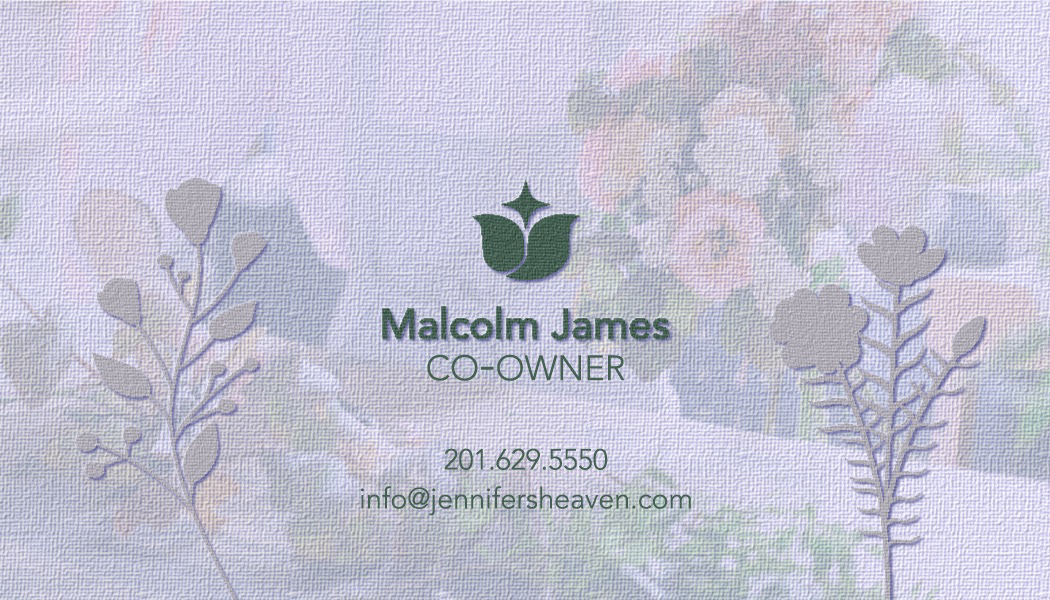
The stationery suite was designed with a focus on cohesion and consistency, carrying the brand’s soft, celestial identity across each piece. Elements like a golden radial halo motif add a subtle sense of divinity and light, while an emboss effect was applied throughout to give the designs an elevated finish. From the business card to the letterhead and brochure, every detail supports the brand’s vision of florals that feel heaven-sent.
Front Business Card
Back Business Card
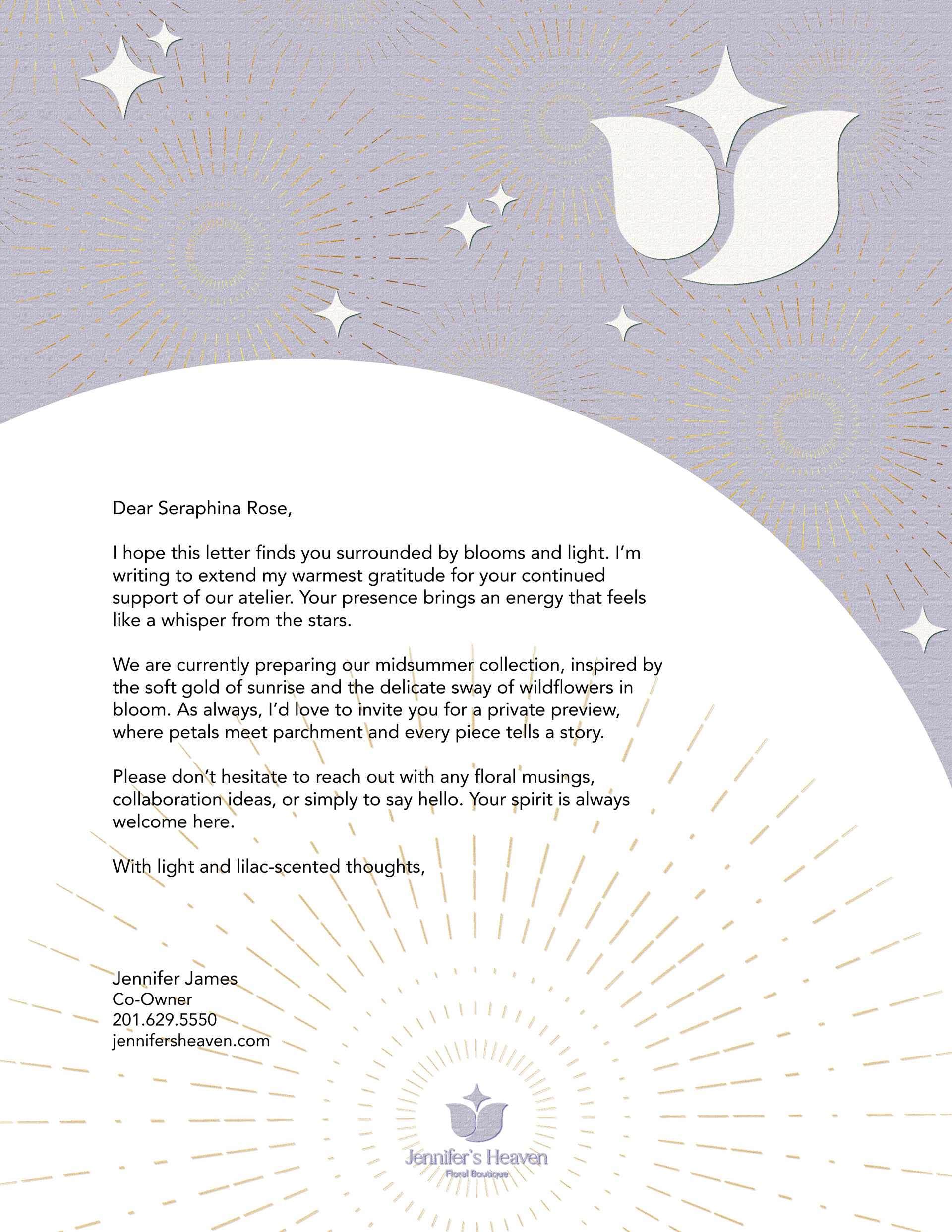
Letterhead Variation 2
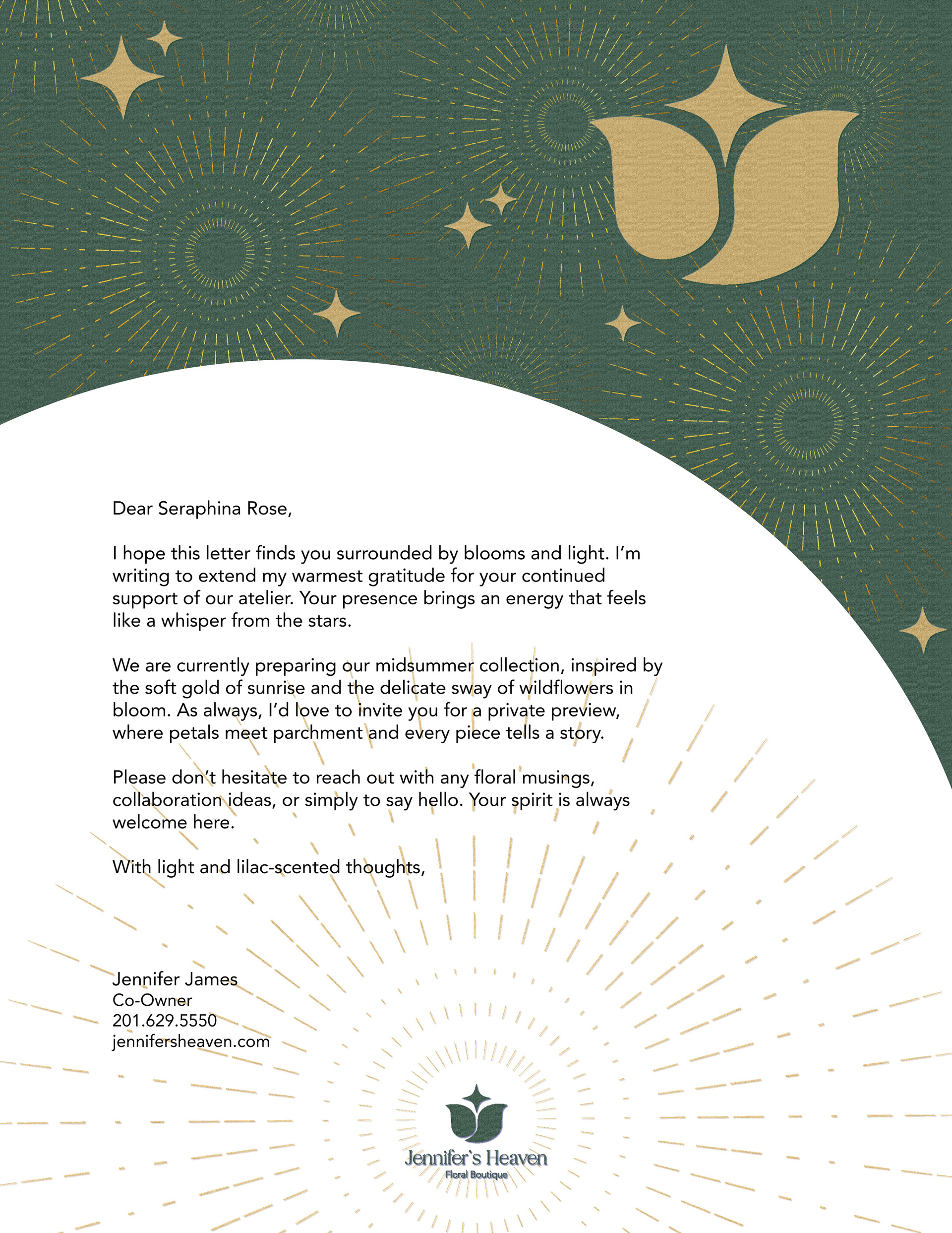
Letterhead Variation 1
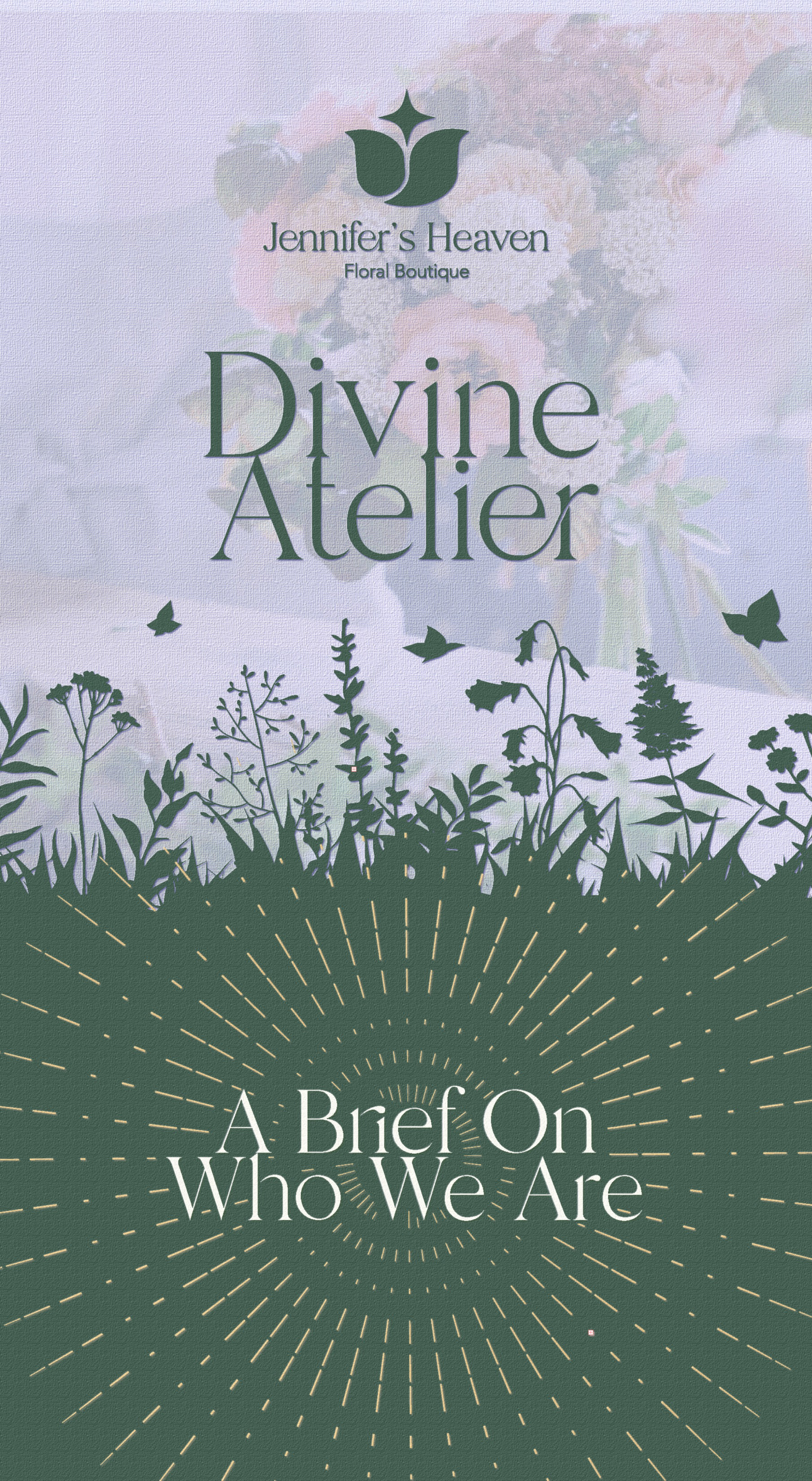
Brochure Design
Rounded Business Cards