
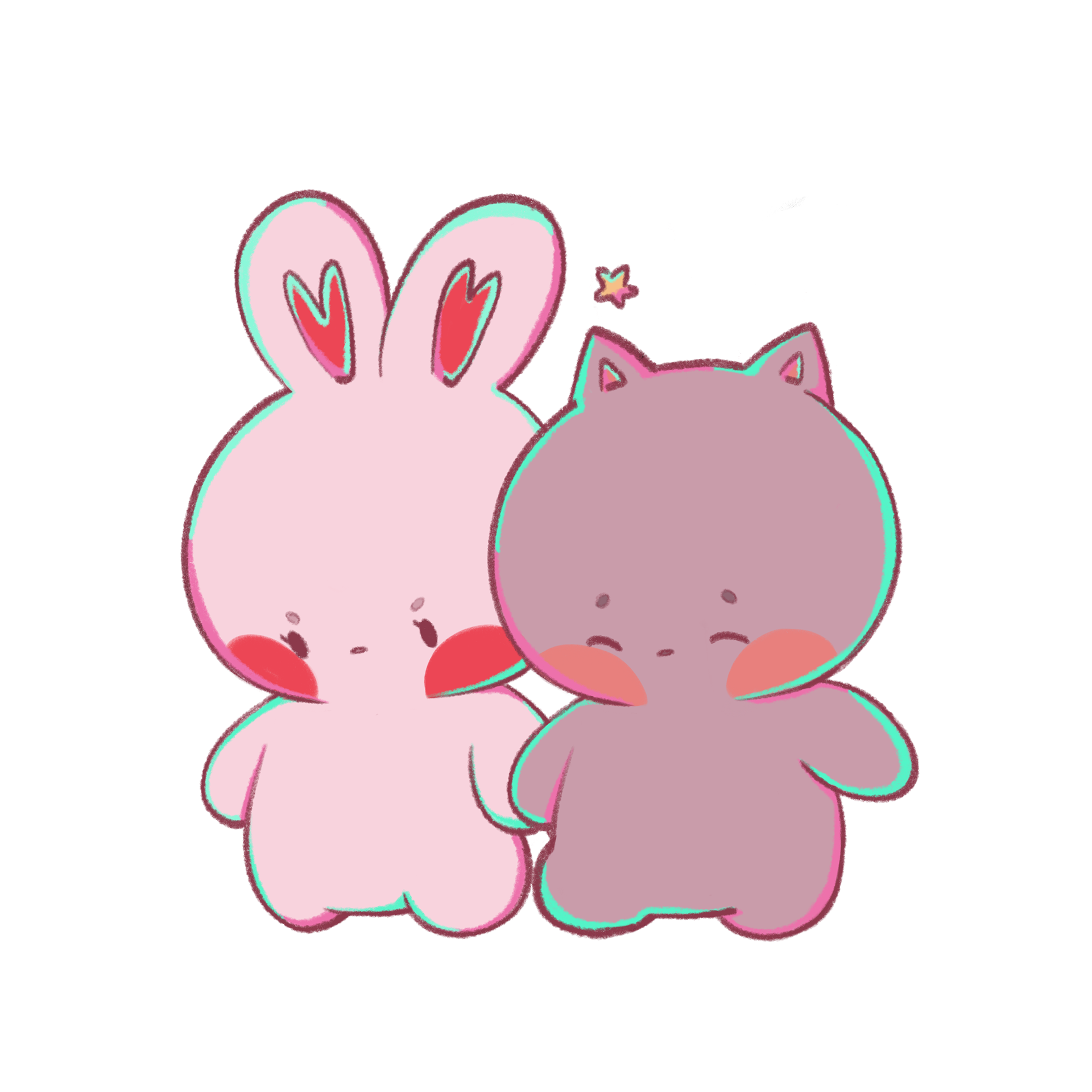
Studio Biko is a conceptual stationery and gift shop that centers around hand-drawn artwork (by me!) of a bunny character named Biko, with her cat partner Ube. This project includes the development of a full visual identity system, from logo and color palette to supporting patterns and type, designed to reflect Studio Biko’s sweet, playful, and heartfelt tone. I illustrated all characters and assets by hand and applied them across a range of physical and a couple of digital touchpoints. Deliverables include:
• A branding system with logo variations, color palette, type system, and custom patterns
• A stationery suite including a letterhead, envelope, and business card design
• Website wireframes and a high-fidelity Figma prototype
• Packaging design for a mailer box and paper bag
• Product design for stickers, a notebook, and an acrylic charm
• A short logo animation for motion branding
The goal was to create an immersive brand world that feels whimsical, warm, and handmade, just like the products themselves.
DESIGN TOOLS USED: Adobe Illustrator, Adobe Photoshop, Adobe After Effects, Procreate, Paper by WeTransfer, Figma
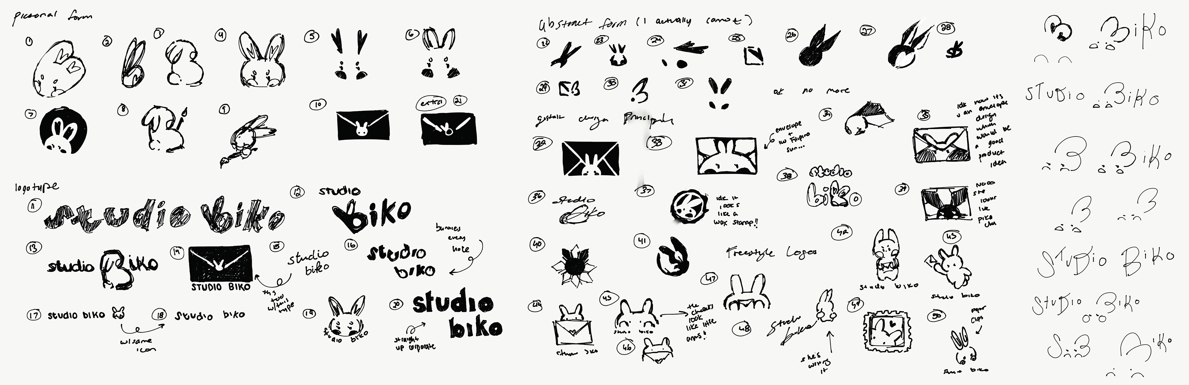
Logo Sketches
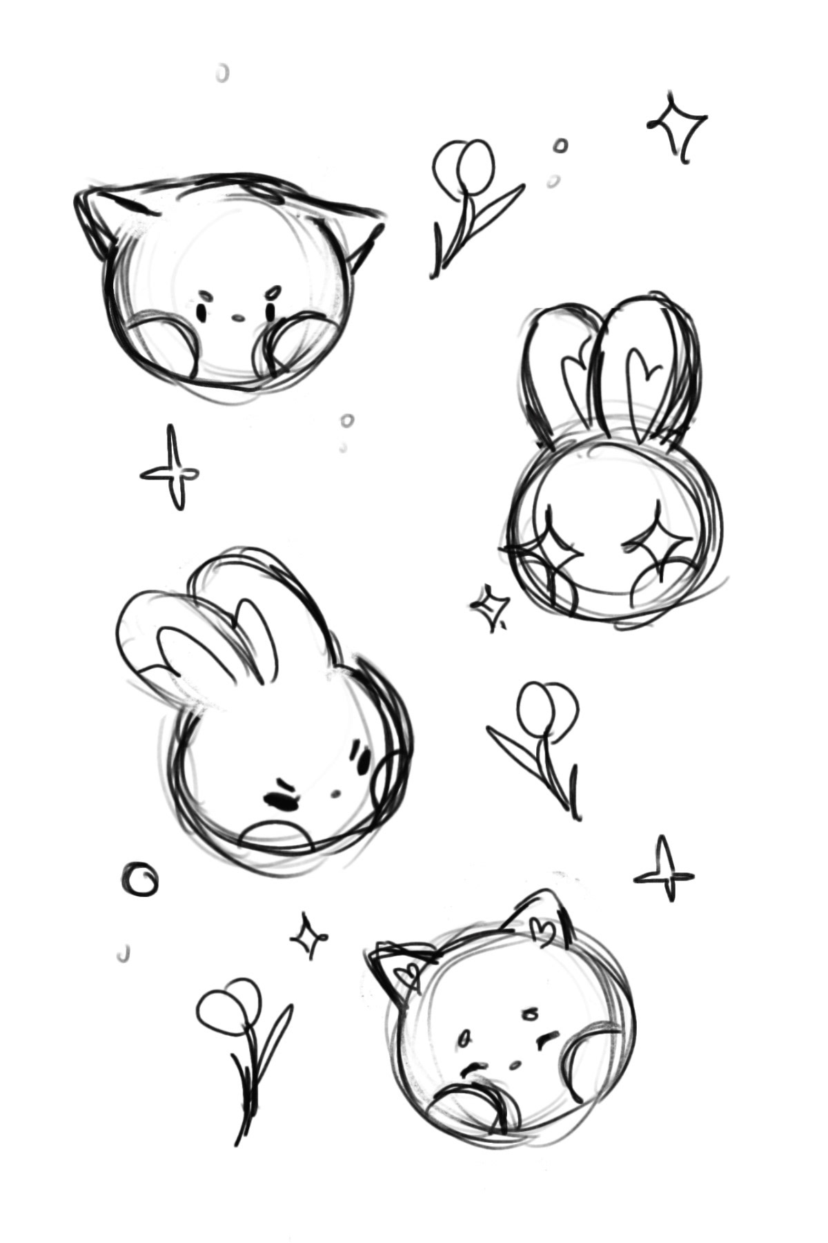
Studio Biko was conceptualized to be real someday and sell the products I designed and created from my own home. I wanted to capture an essence that was a mix of romance, whimsy, comfort, something that screamed made by hand, and something that communicated cute stationery and gift shop. I experimented with plenty of ideas and decided on four drafts to clean up and figure out which worked best. I also considered other assets (such as the elements in the pattern) that would communicate the essence.
Logo Drafts
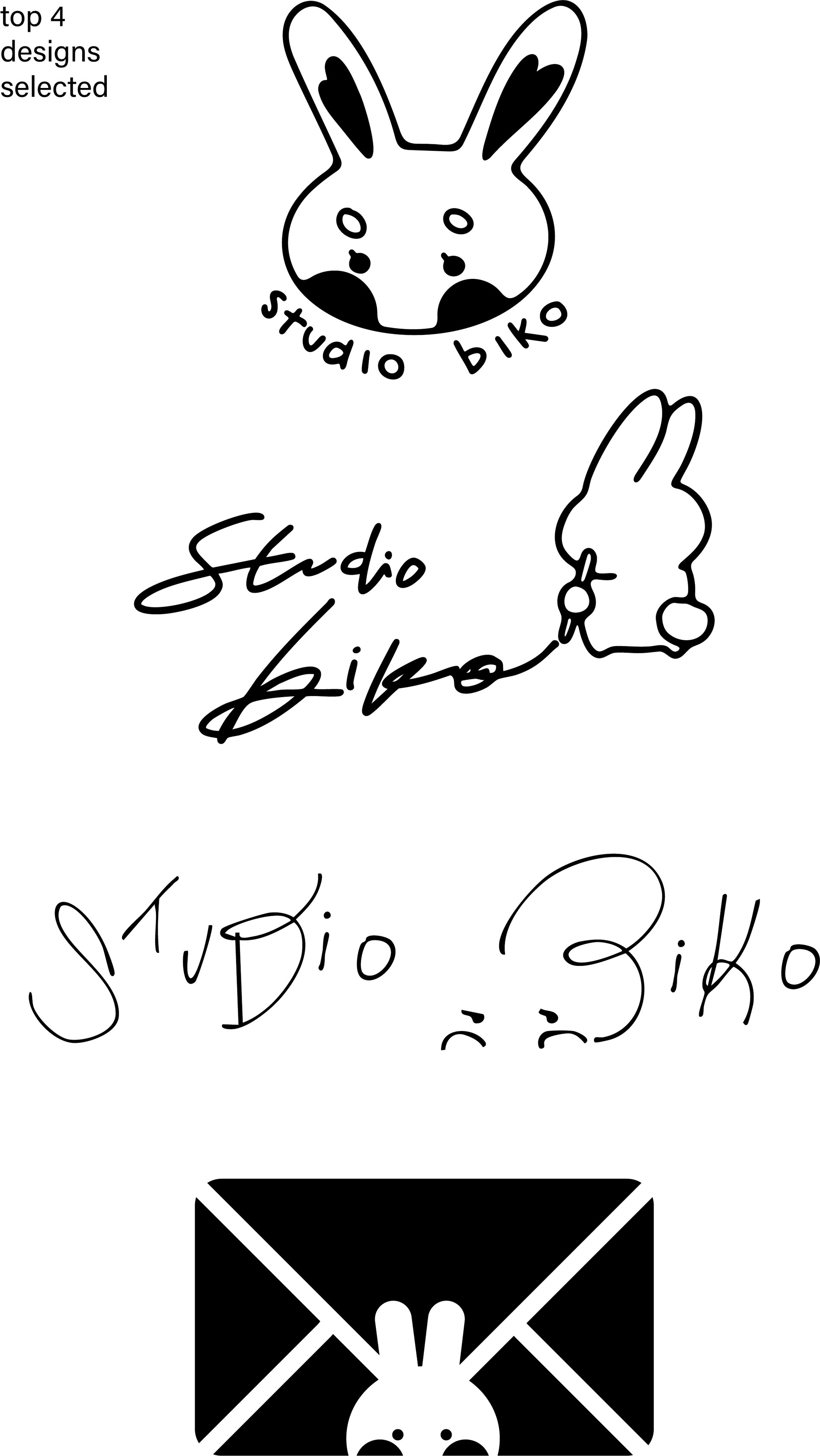
4 Selected Designs
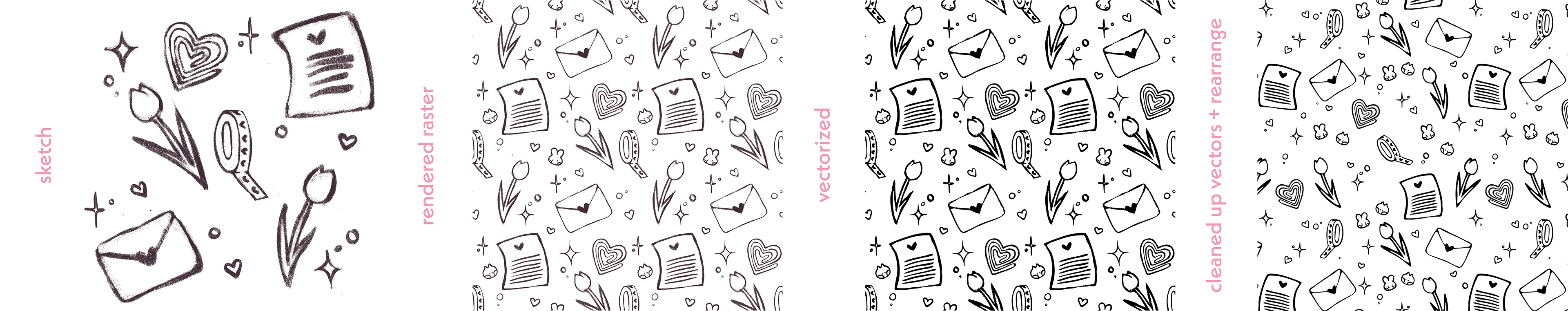
Pattern Sketch
Typography
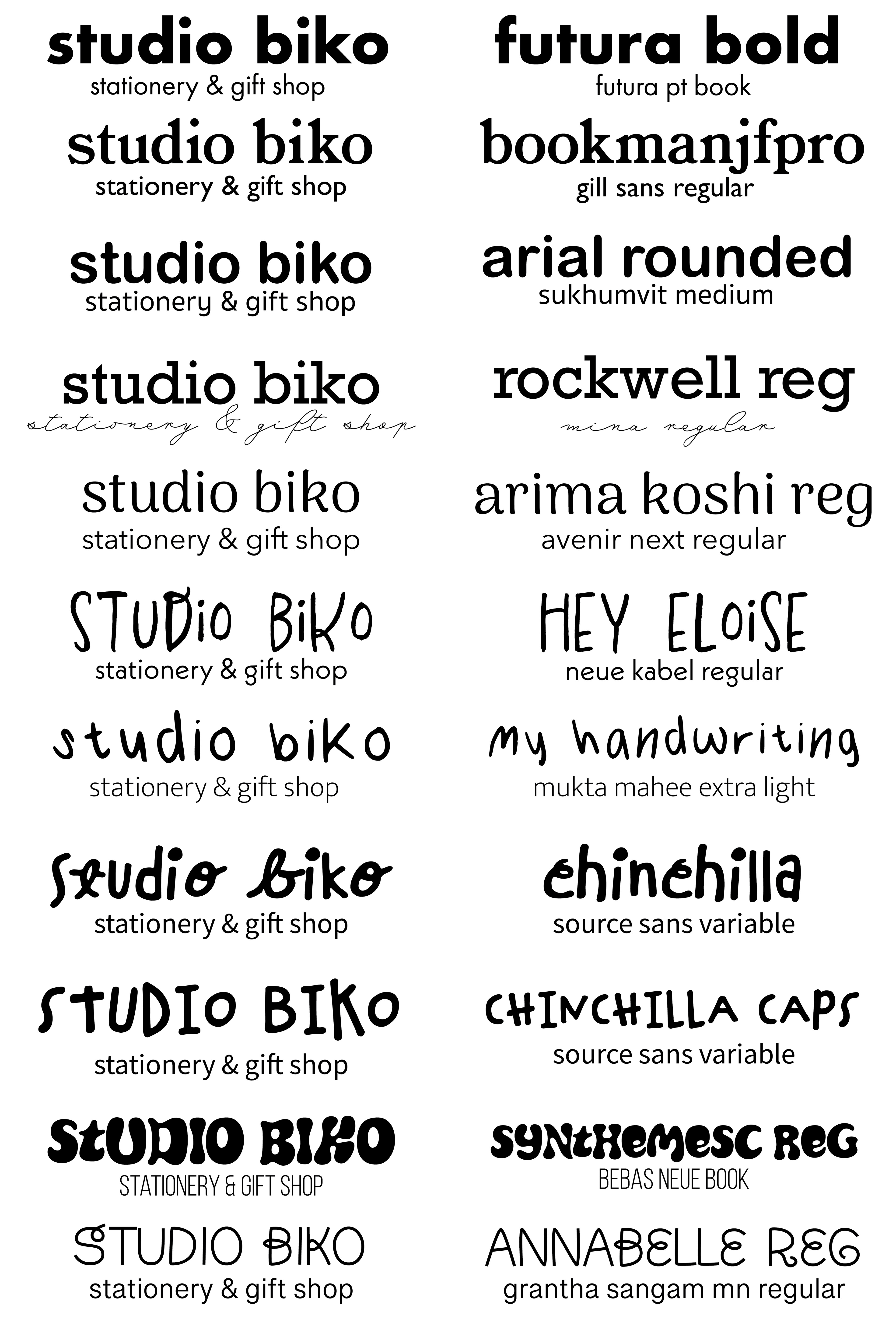
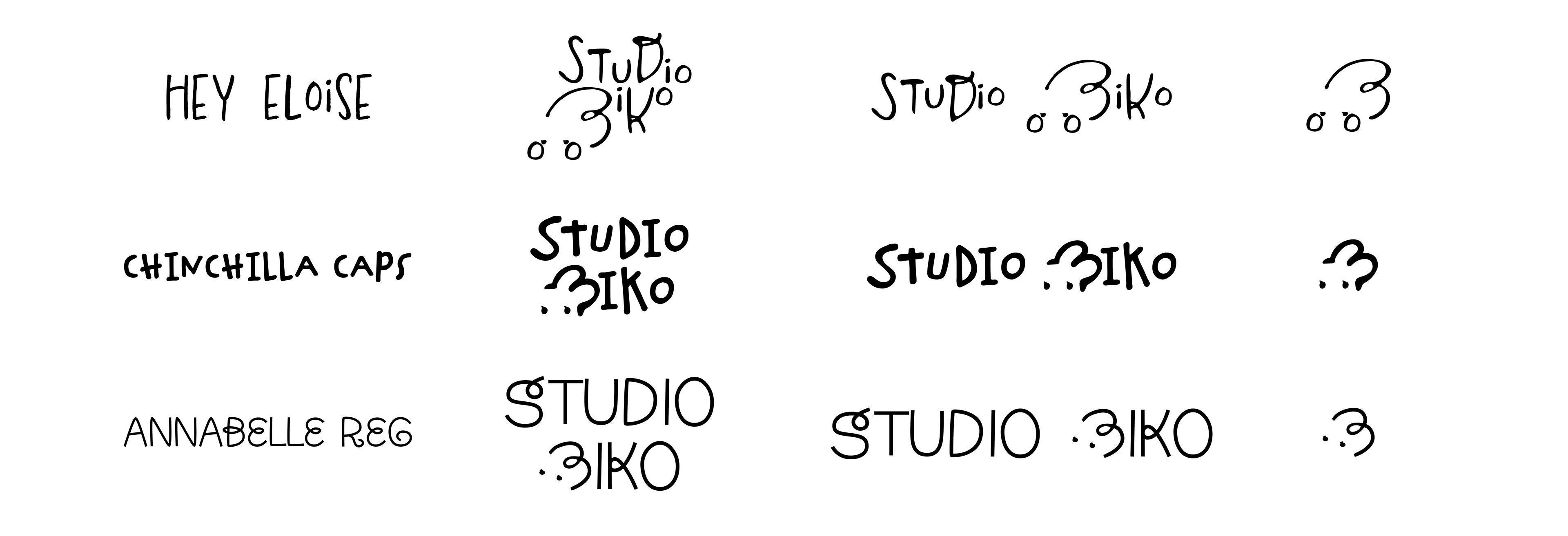
After deciding on what the general idea of the logo would look like, I explored many typefaces and their fonts. The most similar to the sketch I settled on was Hey Eloise (romantic and comforting); however, I found that Chinchilla (cute and handmade) and Annabelle (whimsical and cute) produced other moods that I wanted. The secondary typeface chosen (Neue Kabel) was ultimately scrapped in the logo itself; however was later utilized in the stationery, products, packaging, and website.
Pattern Progress
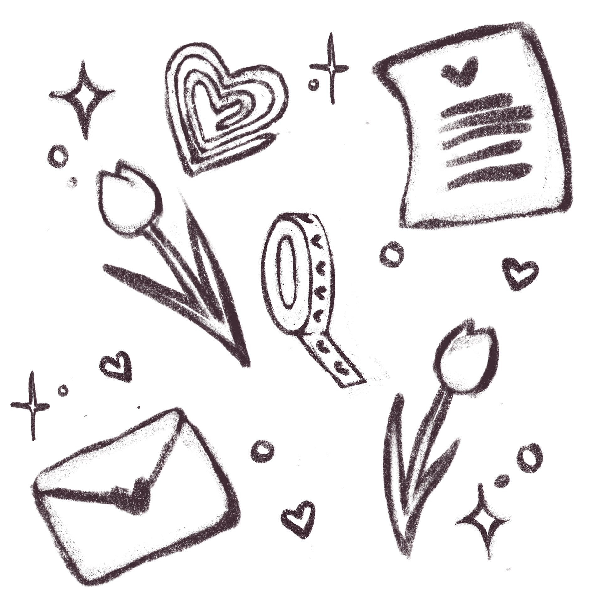
I wanted to communicate the romantic stationery aspect of the brand through the pattern, while keeping it whimsical and playful, while keeping in mind to keep it versatile as independent brand assets. The final pattern reflects a repeat of tulips, stars, hearts, love letters, paperclips, washi tape, and mini versions of Biko & Ube.
Final Logo System & Brand Pattern
After spending so much time on the three typefaces, I decided to combine elements and stylized the Chinchilla typeface, as Chinchilla provided the necessary playful, handmade vibe. Romance can be communicated through the color palette and other brand assets such as the heart-shaped paperclip and hearts on the letter and envelope, especially paired with tulips. The whimsicalness from Annabelle was incorporated through the added swashes, especially through the letter B. The final logo system consists of a primary, secondary, and mark. The color palette features playful and romantic pinks set on either cold or warm neutrals with an accent pop of green.
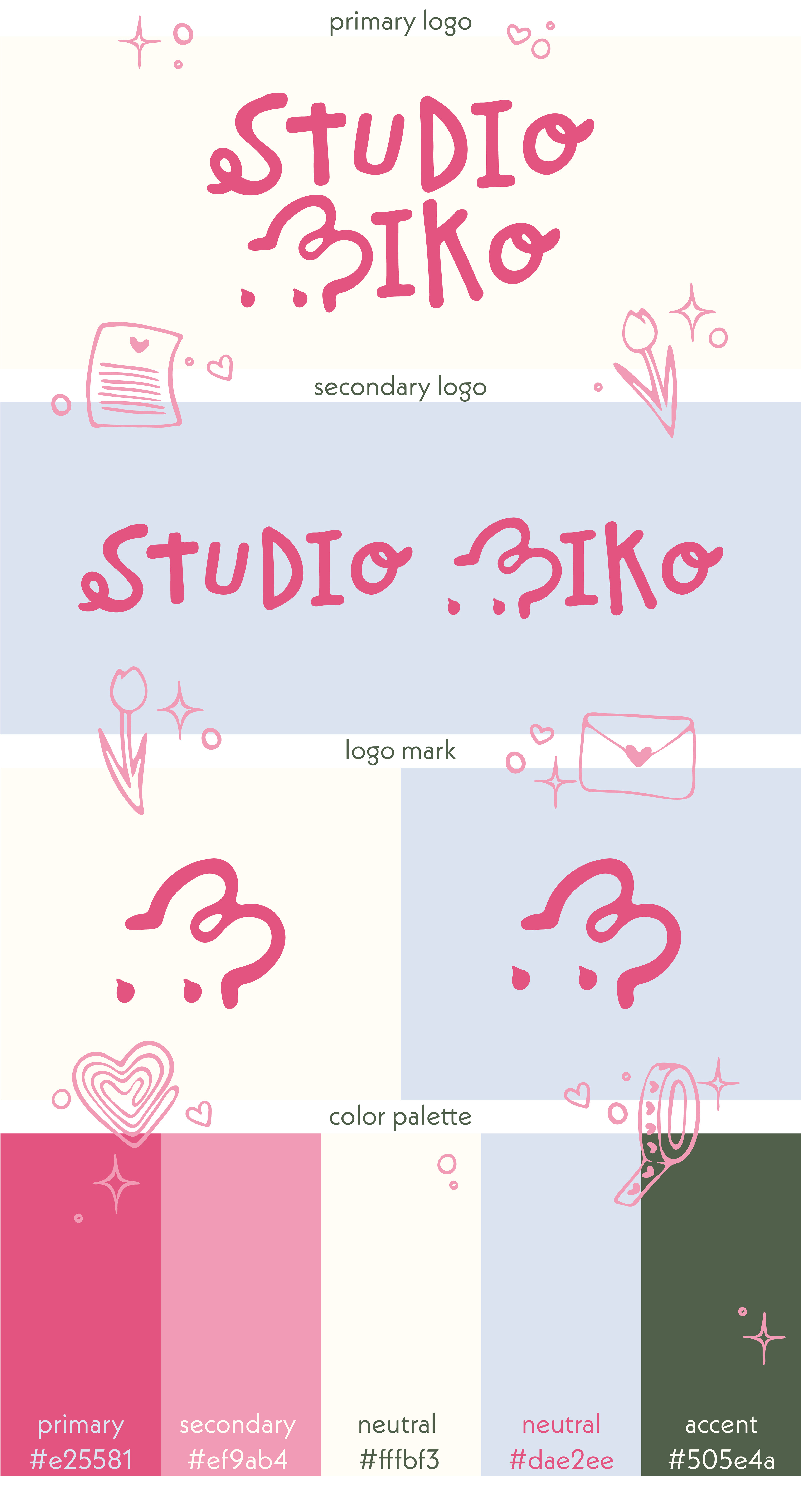
Logo System
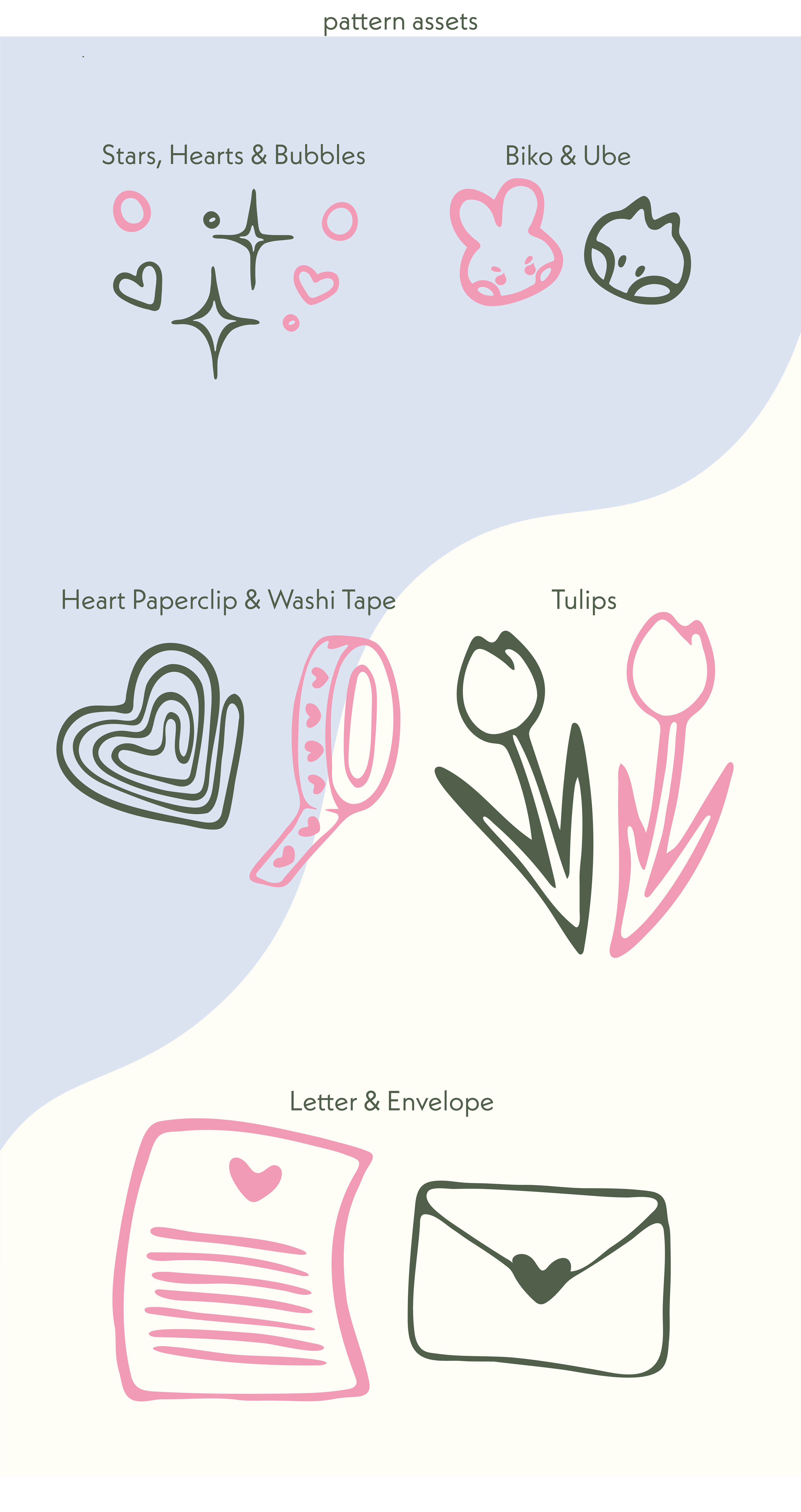
Pattern/Brand Assets
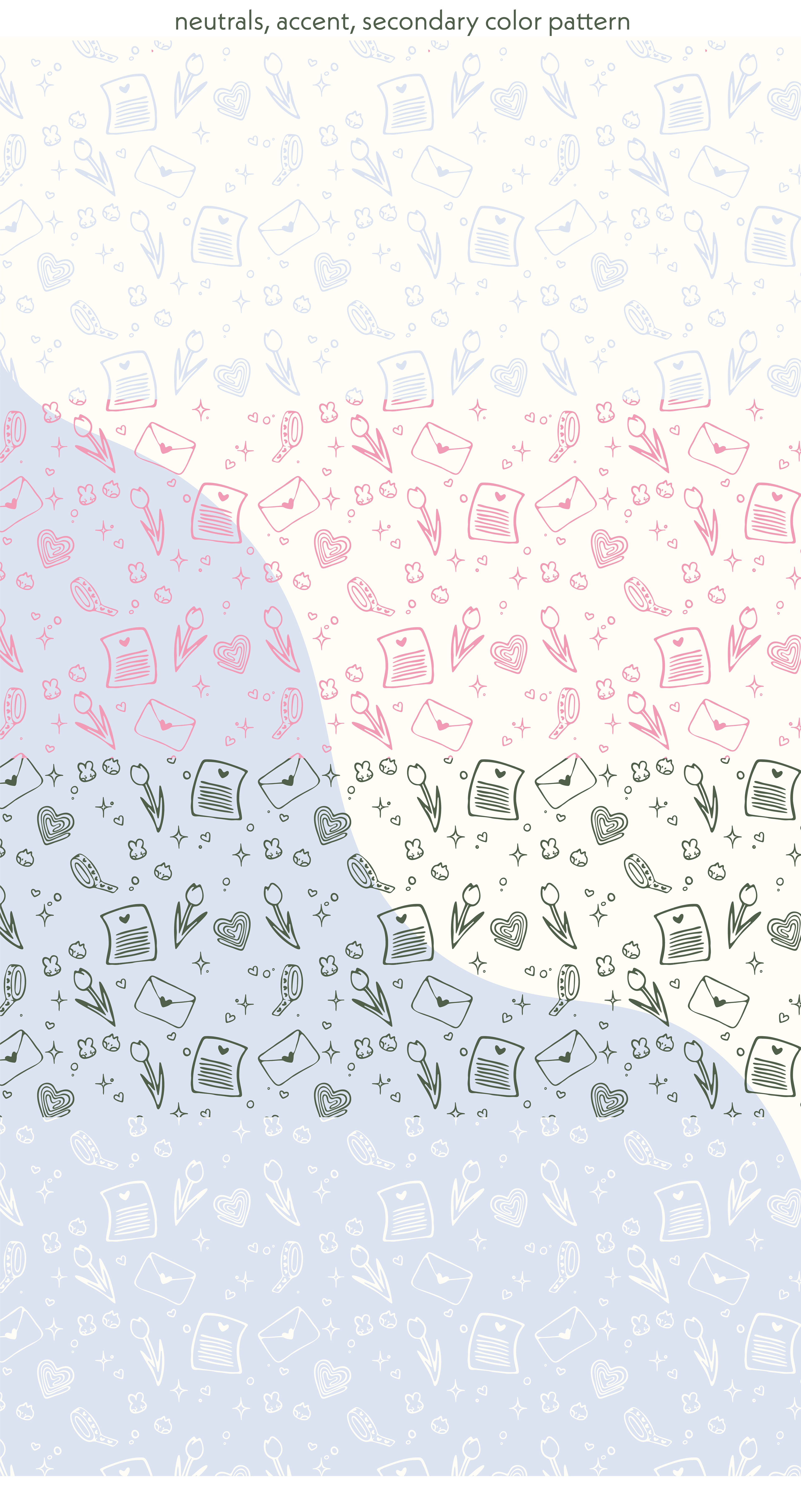
Neutrals, Secondary, and Accent Color Pattern
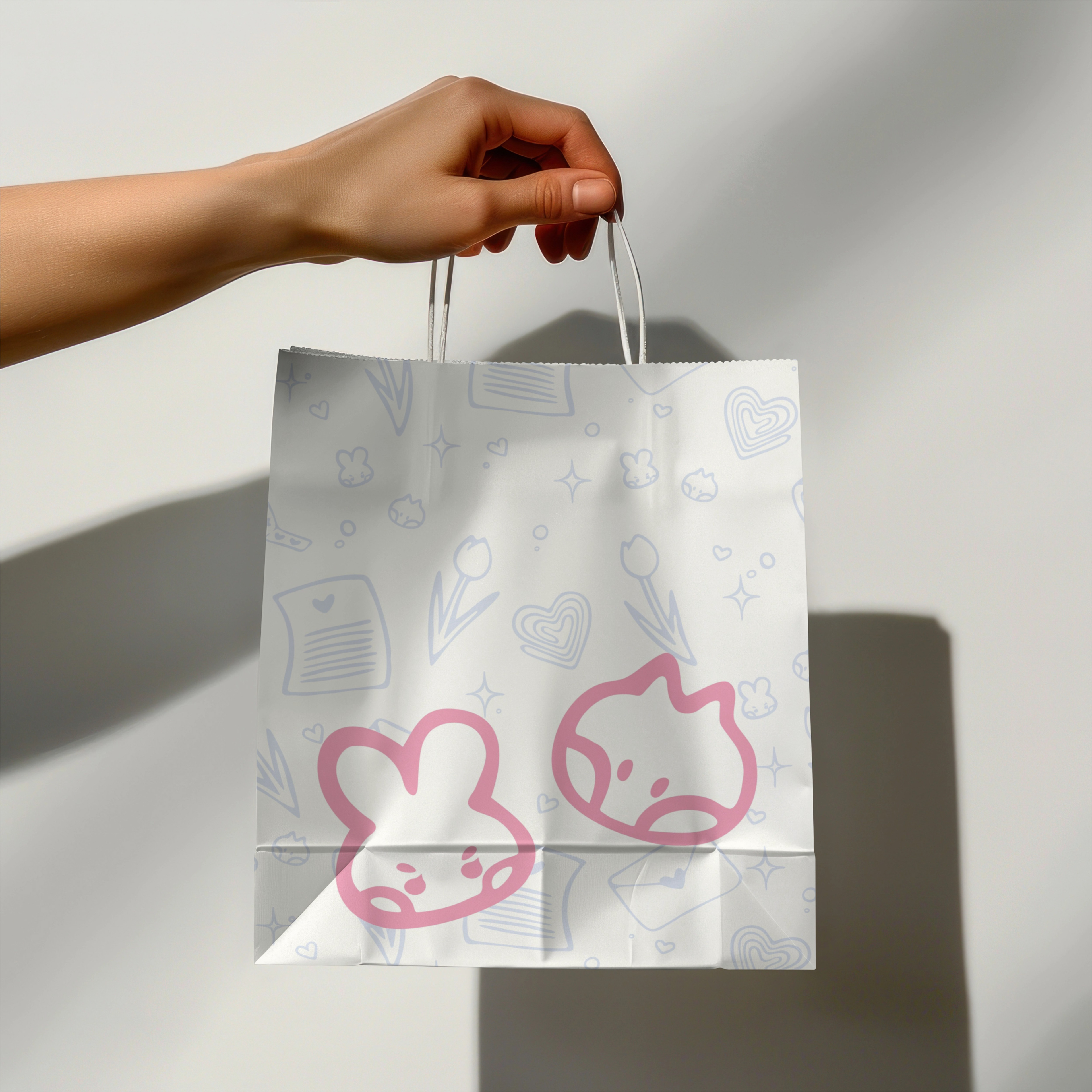
Paperbag
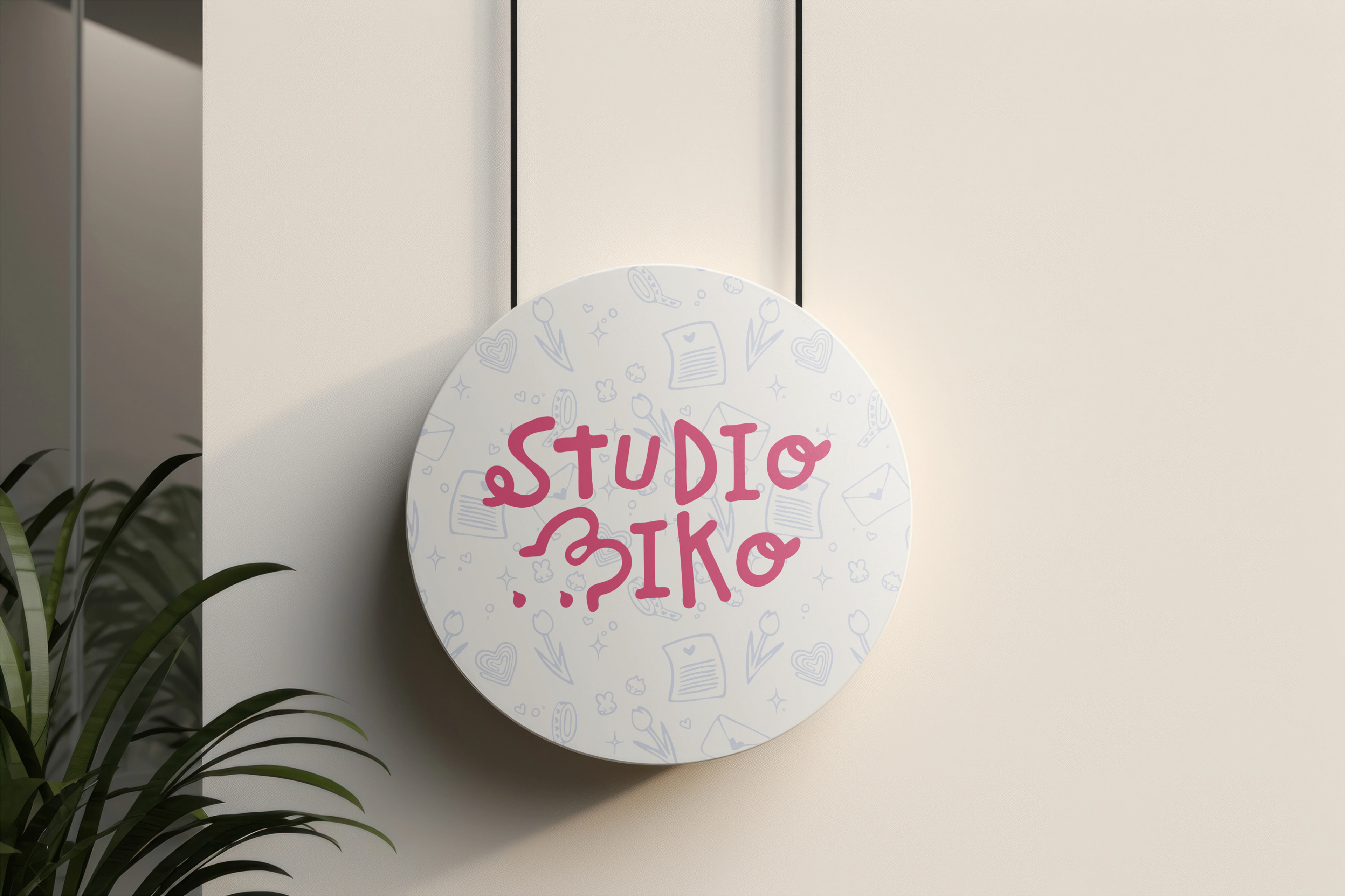
Logo Signage
Logo Animation
I decided to go all out and create a simple but effective logo animation with After Effects. This process was super fun! I had the thought in mind to reflect ink being erased and bring the bunny to life by animating the eyes opening.

Stationery Suite
The stationery suite was designed with a focus on cohesion and consistency, fully utilizing brand assets in creative and various ways. The suite consists of a standard-size letterhead, DL size envelope, and business cards with alternating background colors. (Heart-shaped QR code from Adobe Stock, with modifications, Social Media Icons from Phosphor Icons )
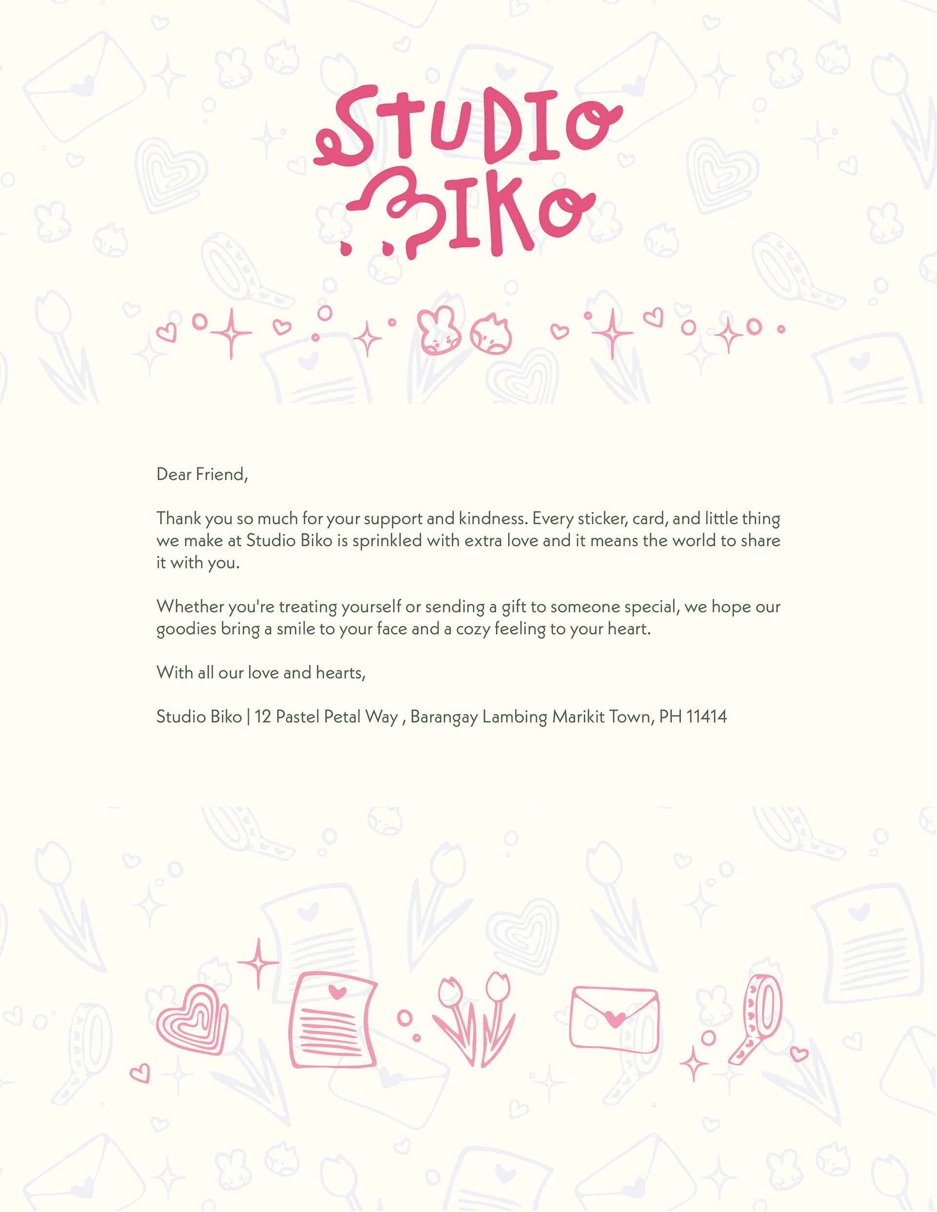
Letterhead
Front Business Card (Variant 1)
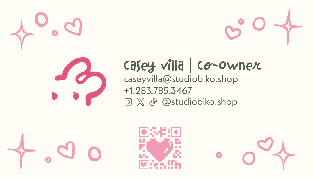
Back Business Card (Variant 1)
Front Business Card (Variant 2)
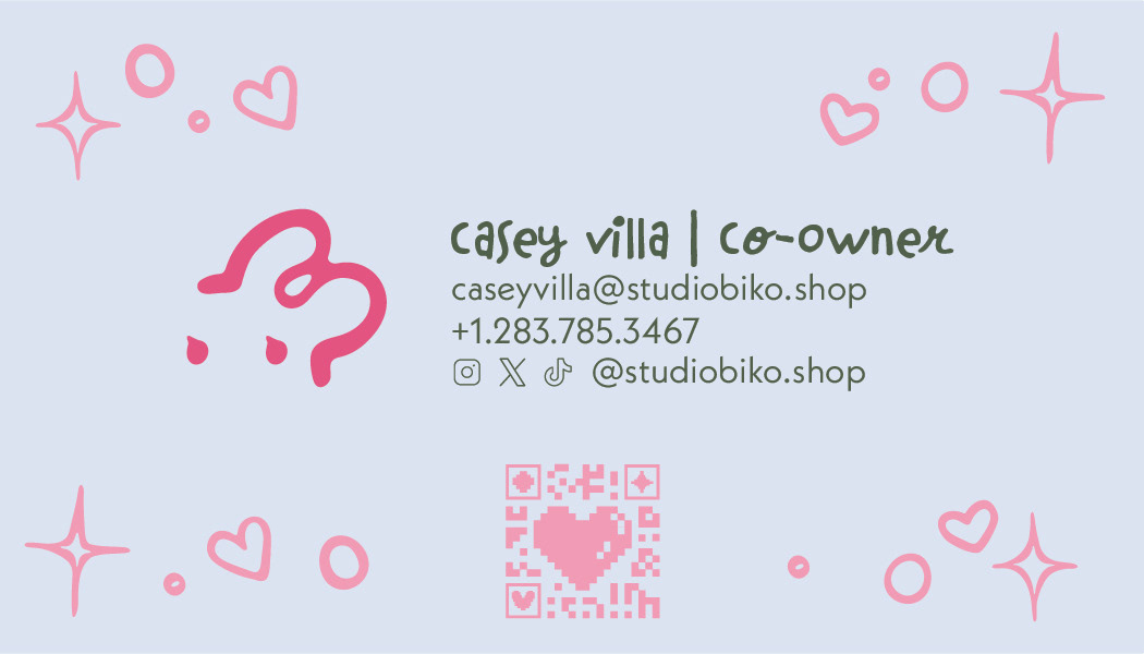
Back Business Card (Variant 2)

Back DL Envelope

Front DL Envelope
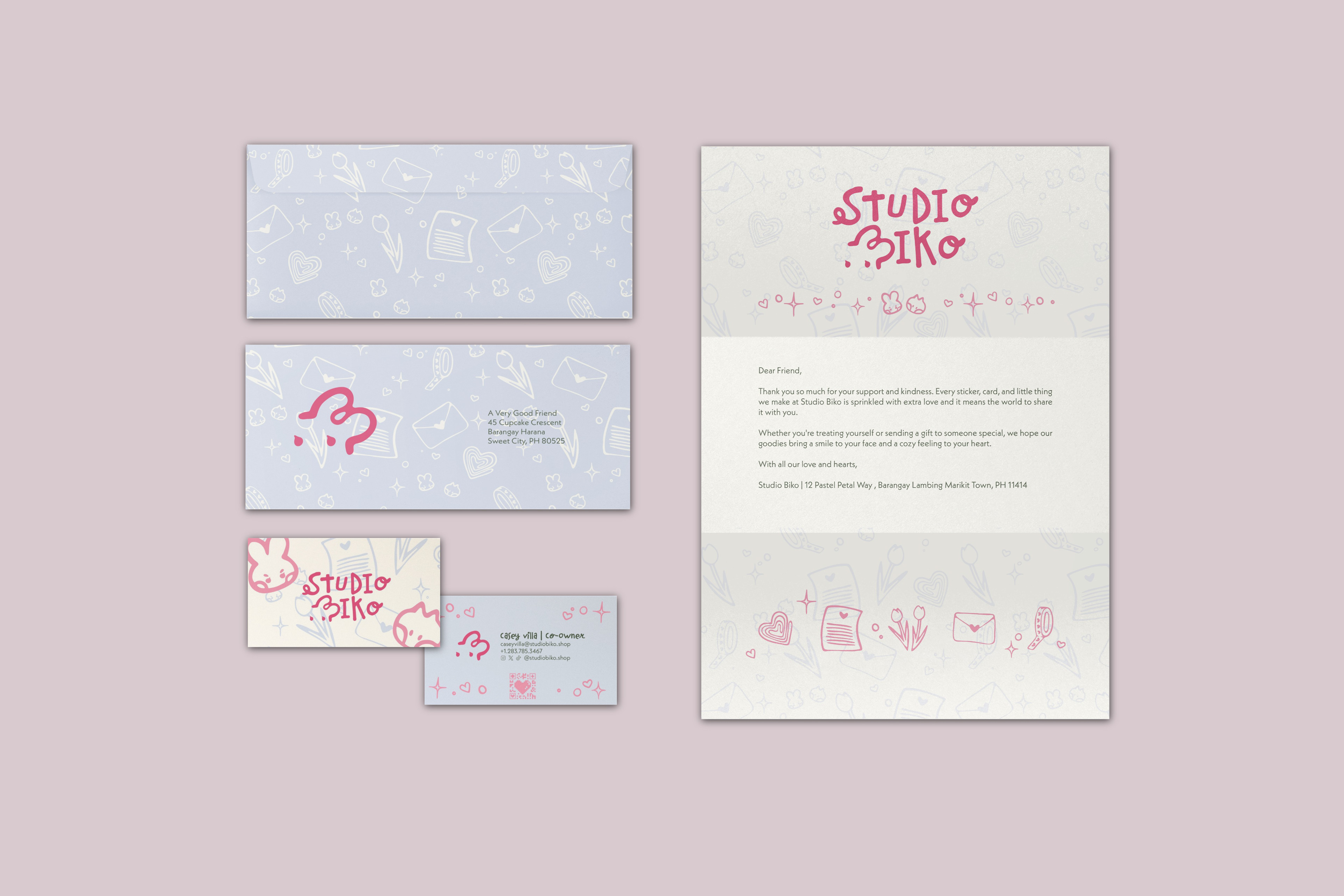
Full Stationery Suite
Product Asset Design Progress
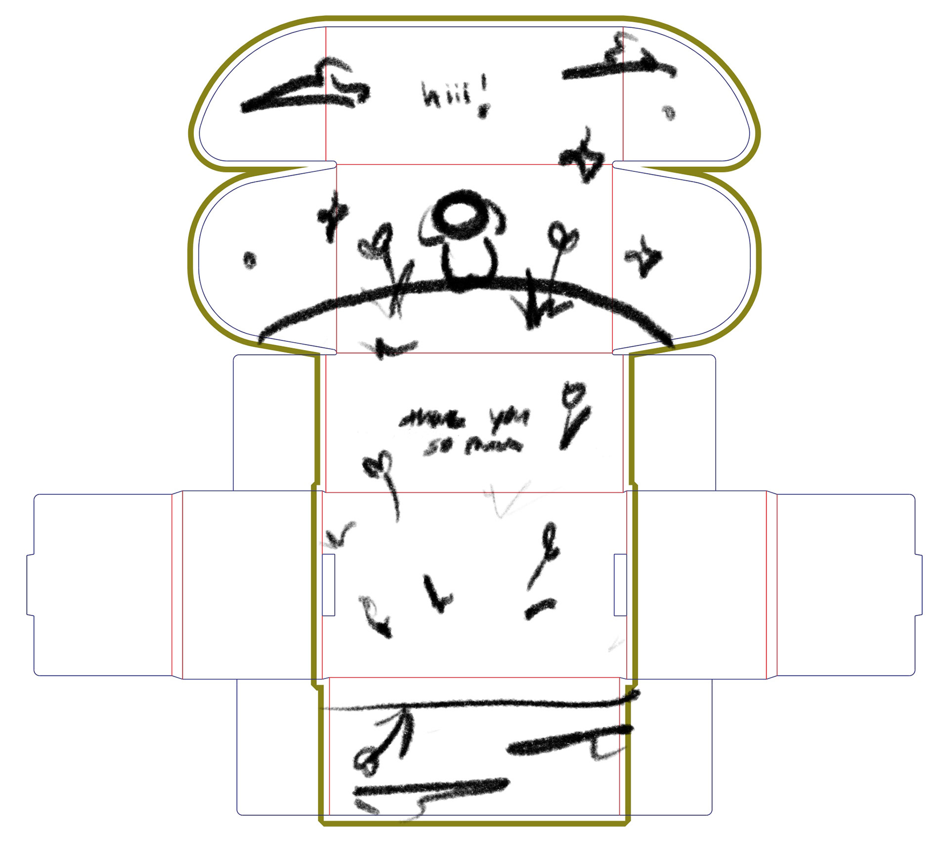
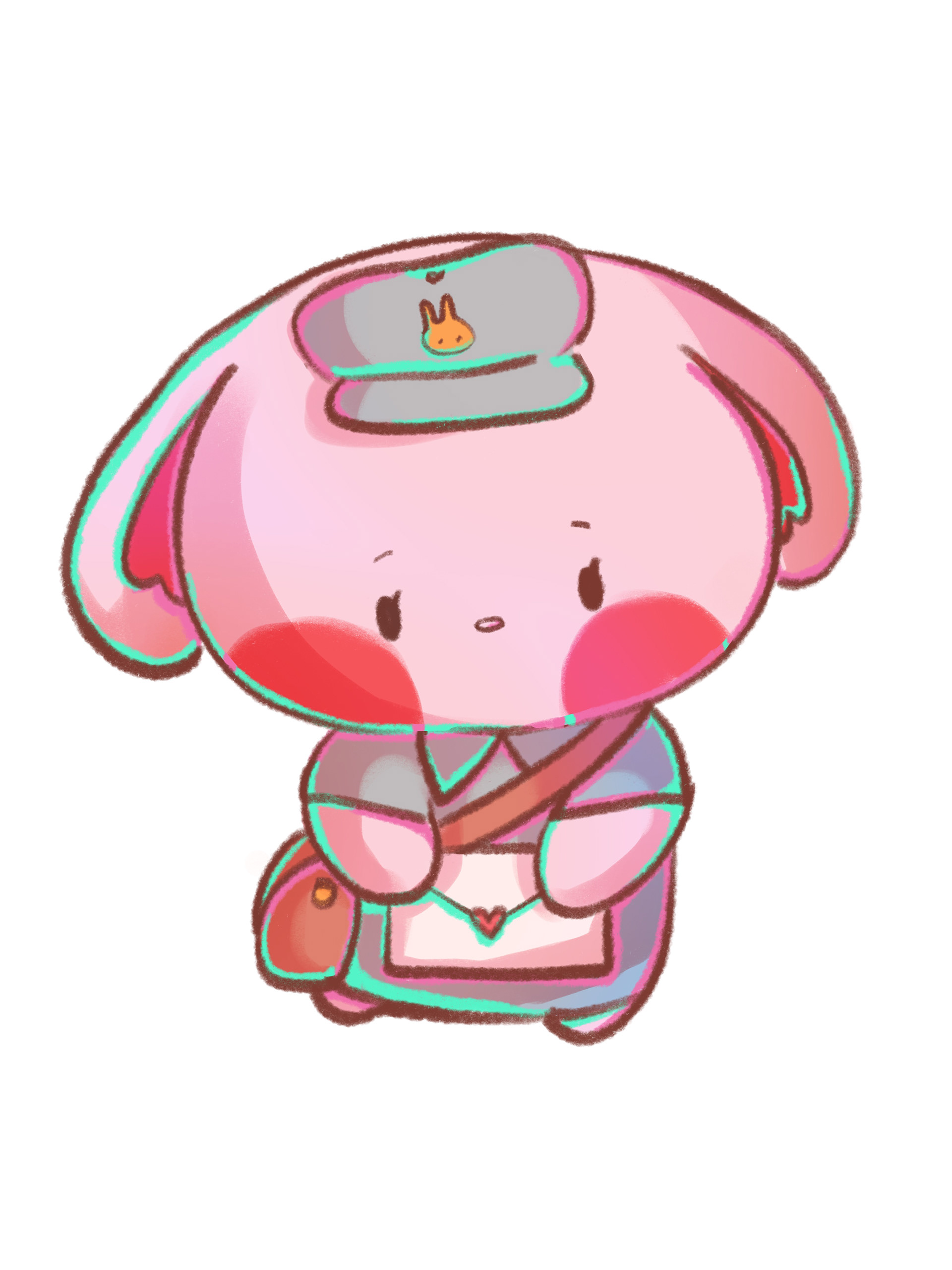
As this project was also designed for my branding class, the initial goal was to create three 2D assets and two 3D assets. For my three 2D assets, I settled on a kiss-cut sticker sheet, a single die-cut sticker, and an A6 thank-you card - all of which I could print and create myself. For my two 3D assets, I went with a 4x6x2in mailer box (die line from Arka) and a 3in acrylic charm (from wooacry). I also created artwork for the website's landing page and as a bonus notebook design.
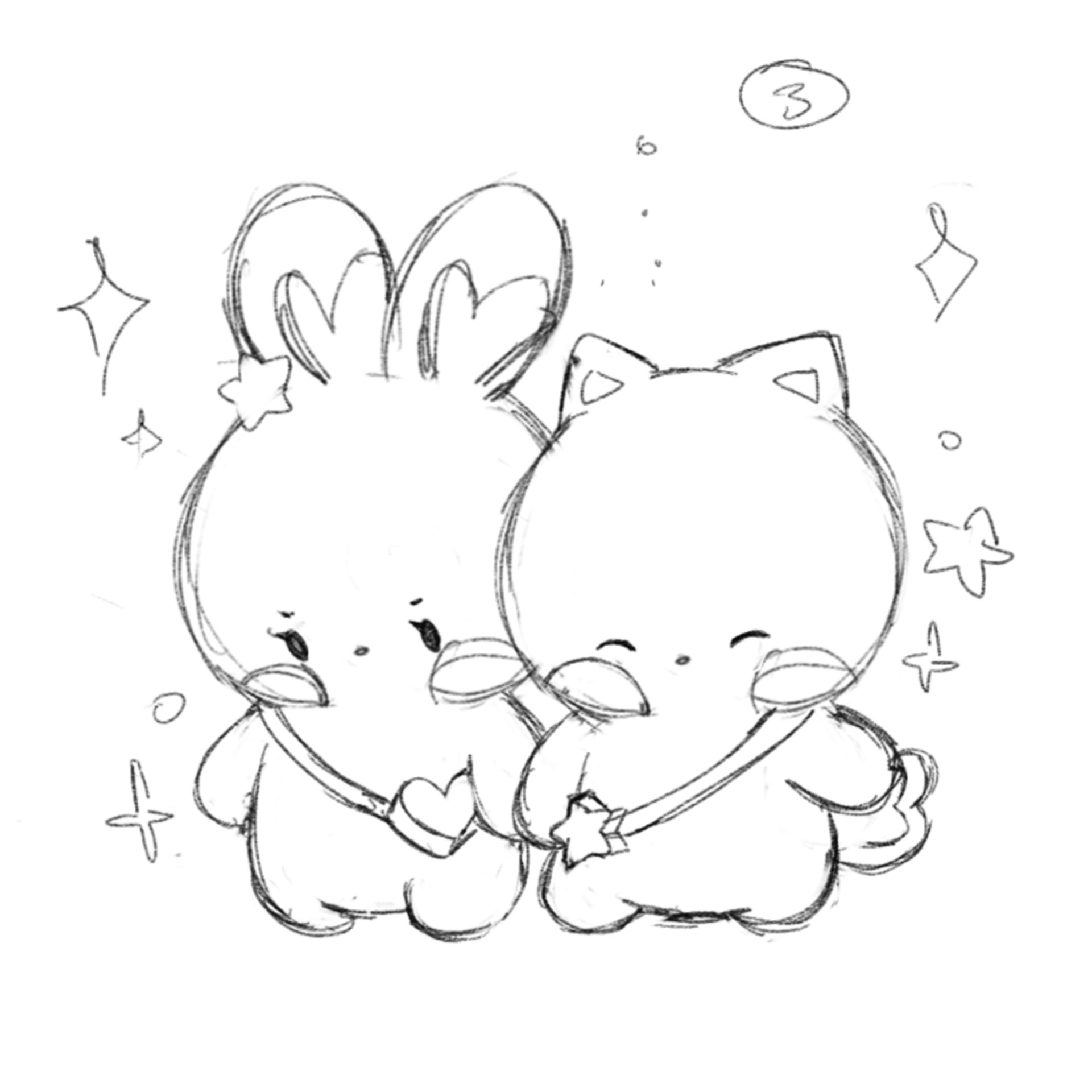
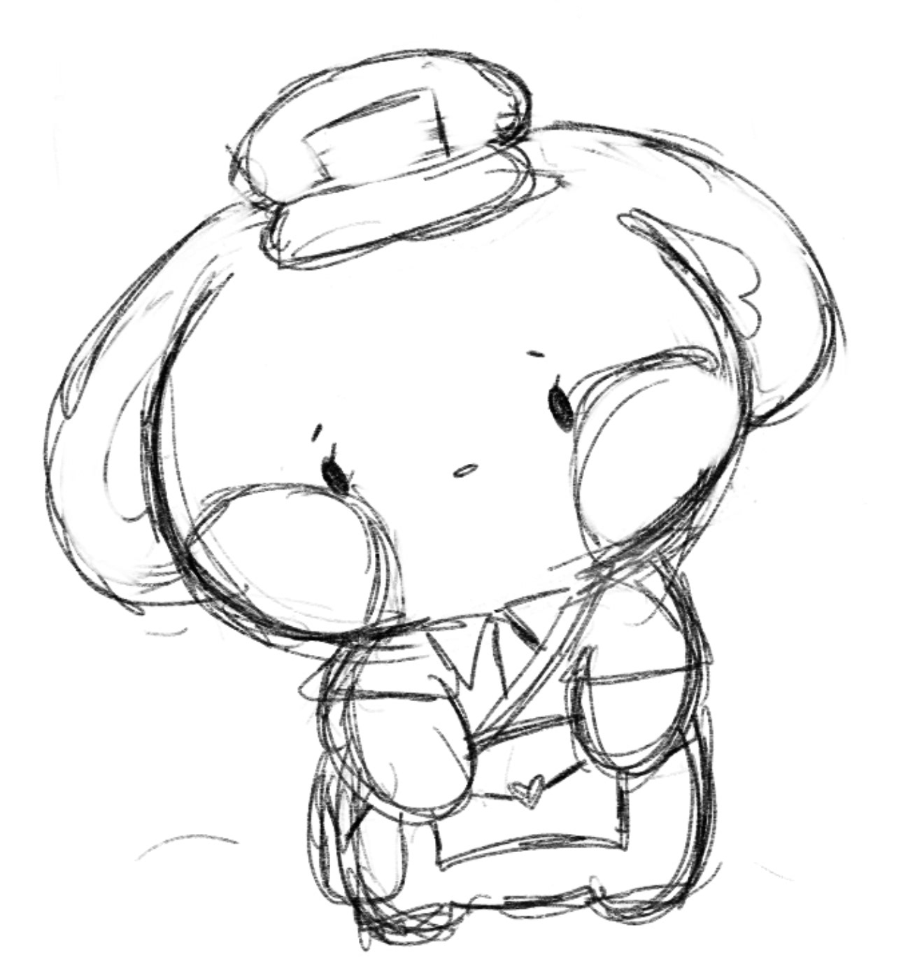
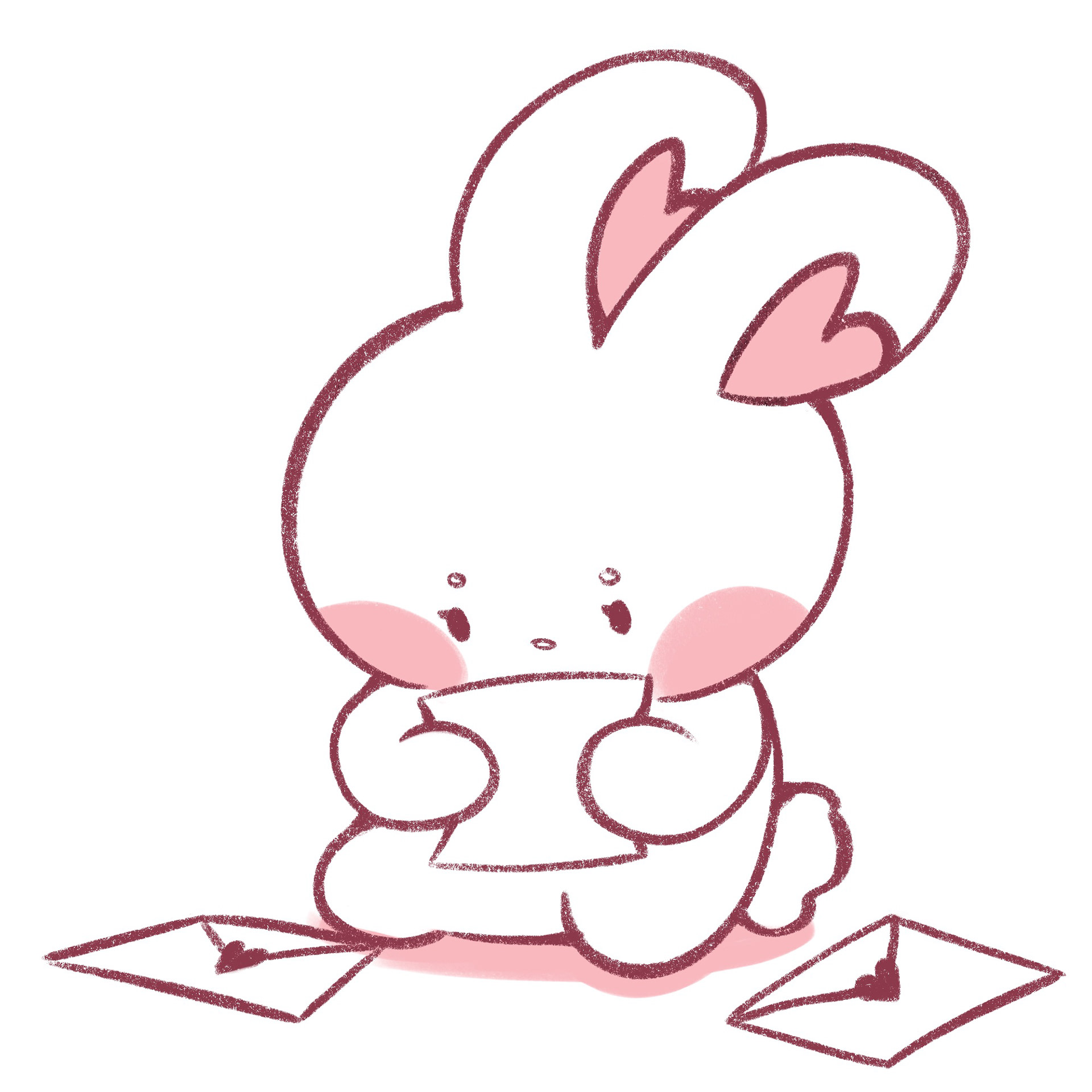
Biko & Ube Sketch
Arka Mailerbox Sketch Inside
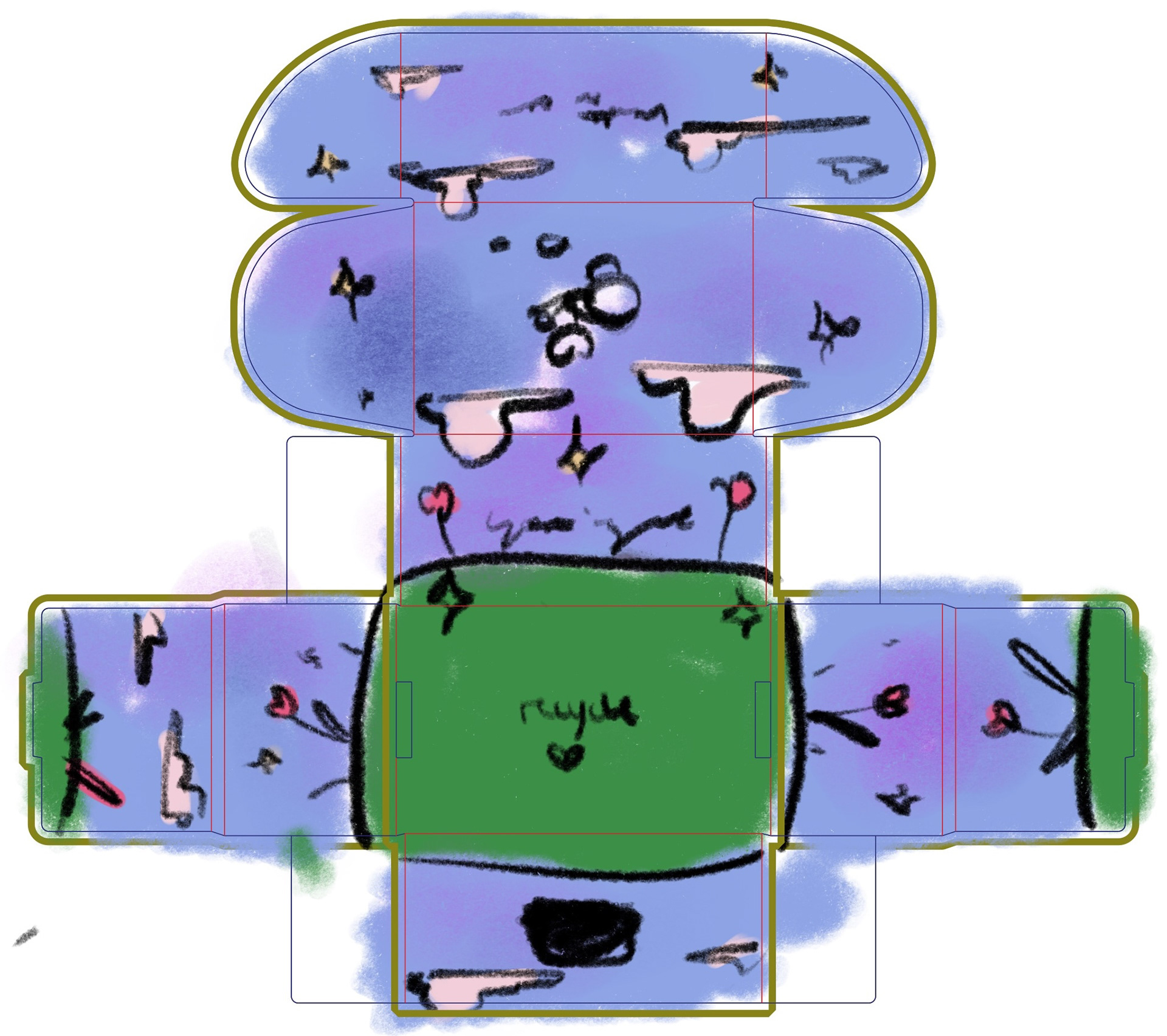
Arka Mailerbox Sketch Outside
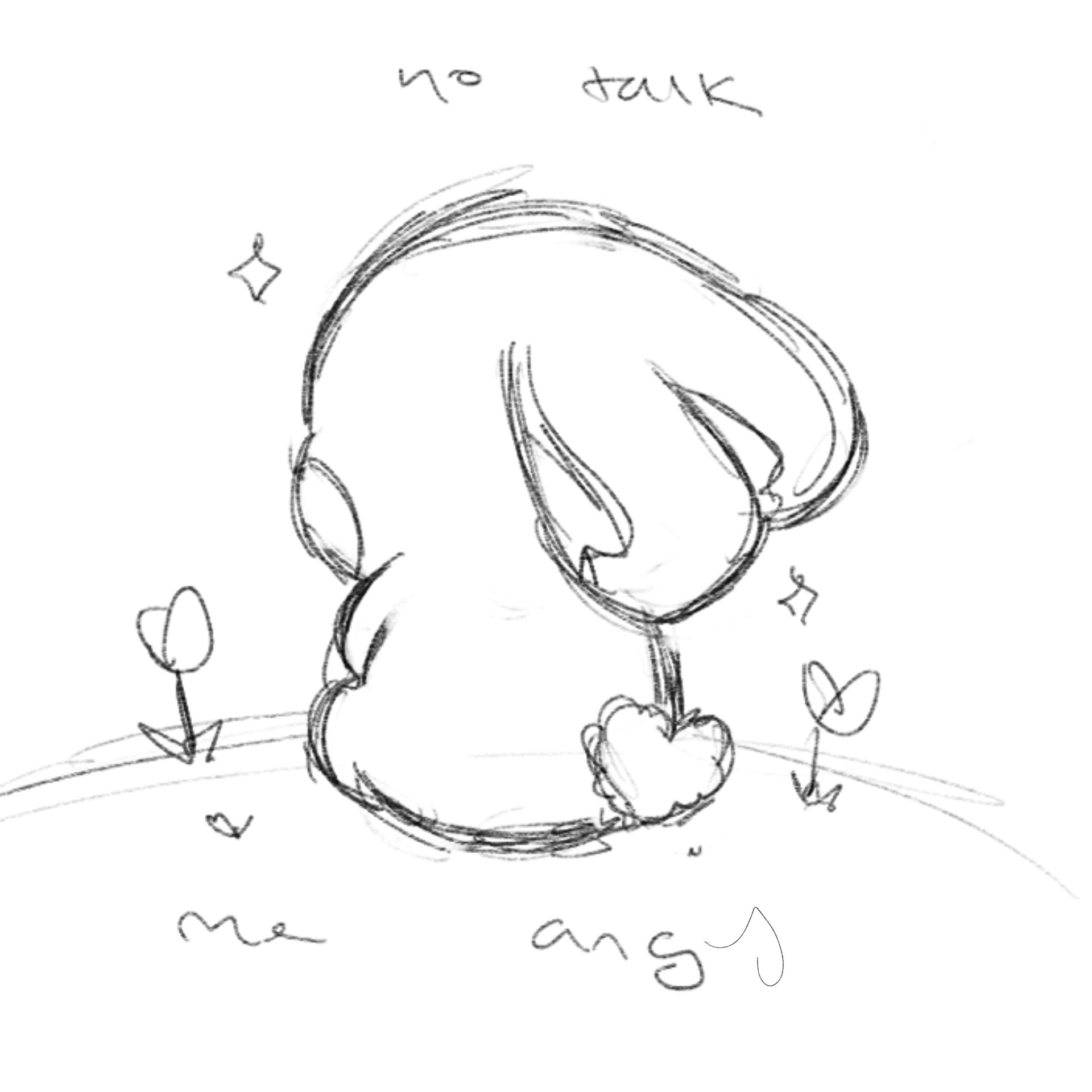
No Talk Me Angy Sketch (initially one sided)
Arka Mailerbox Inside Biko Sketch
Arka Mailerbox Outside Biko Sketch
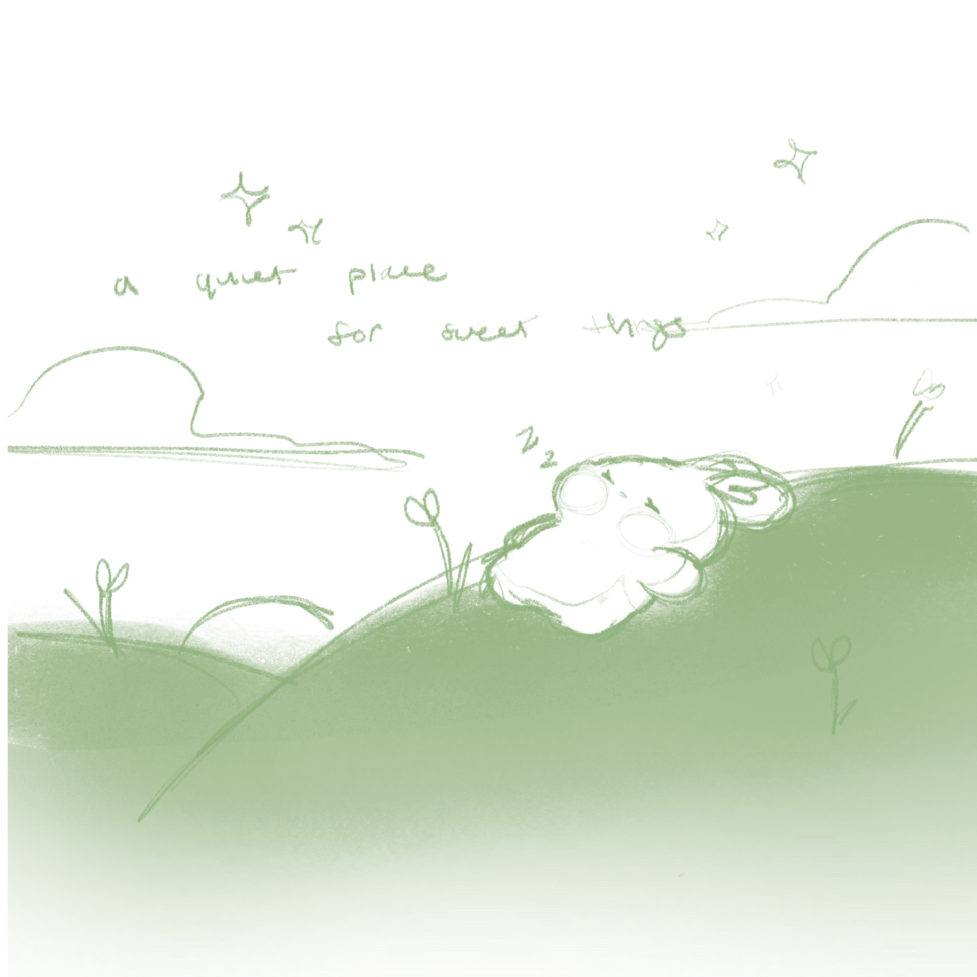
Sleeping Biko Sketch
Sticker Sheet Sketch
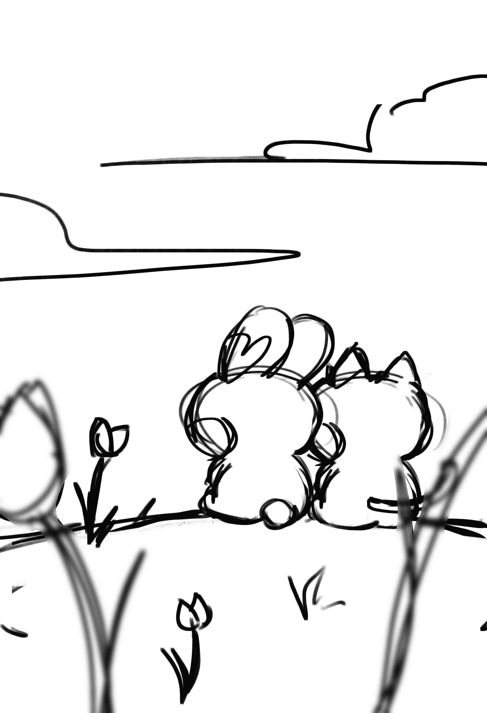
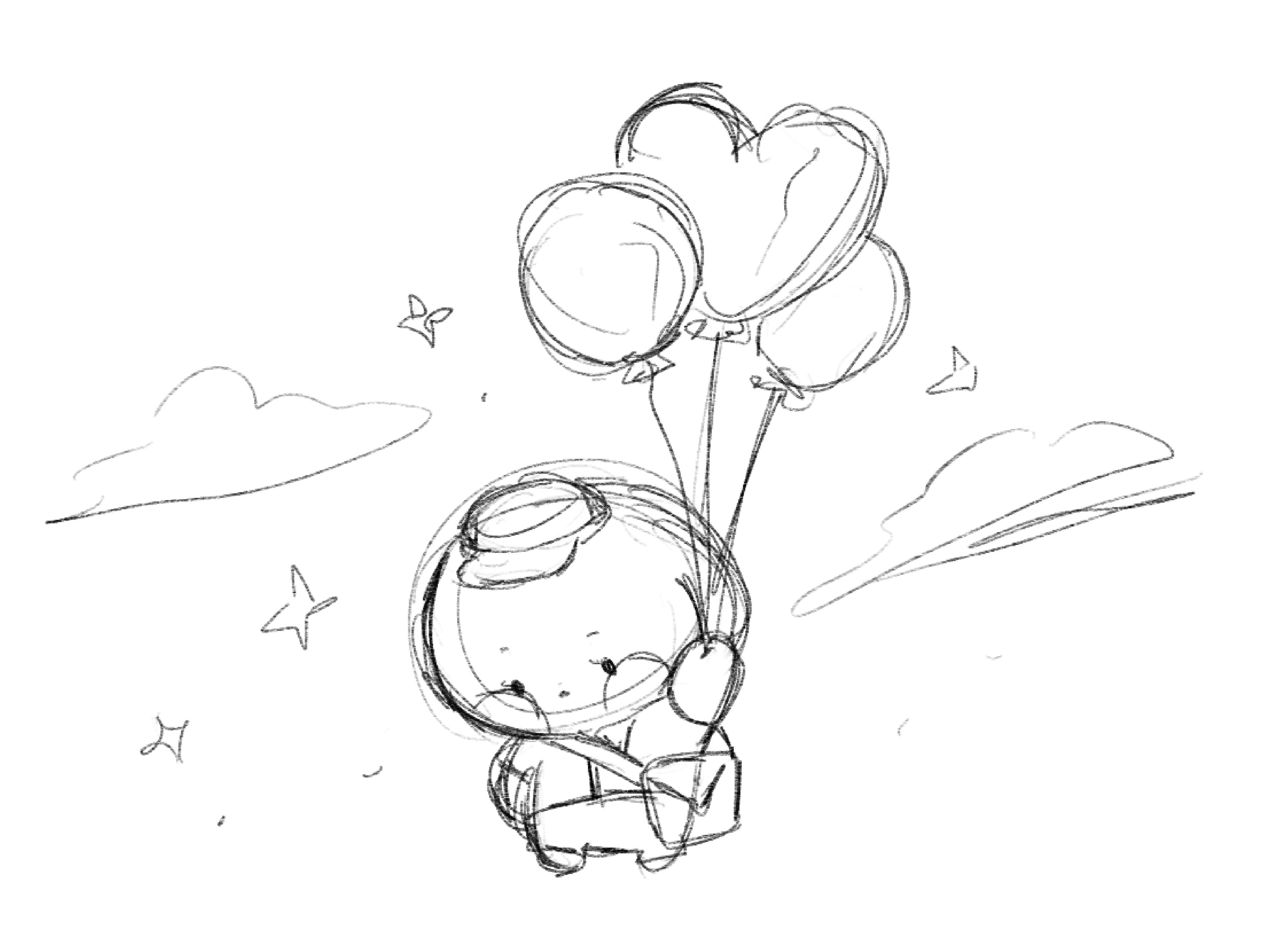
Biko & Ube Starry Sunset Sketch
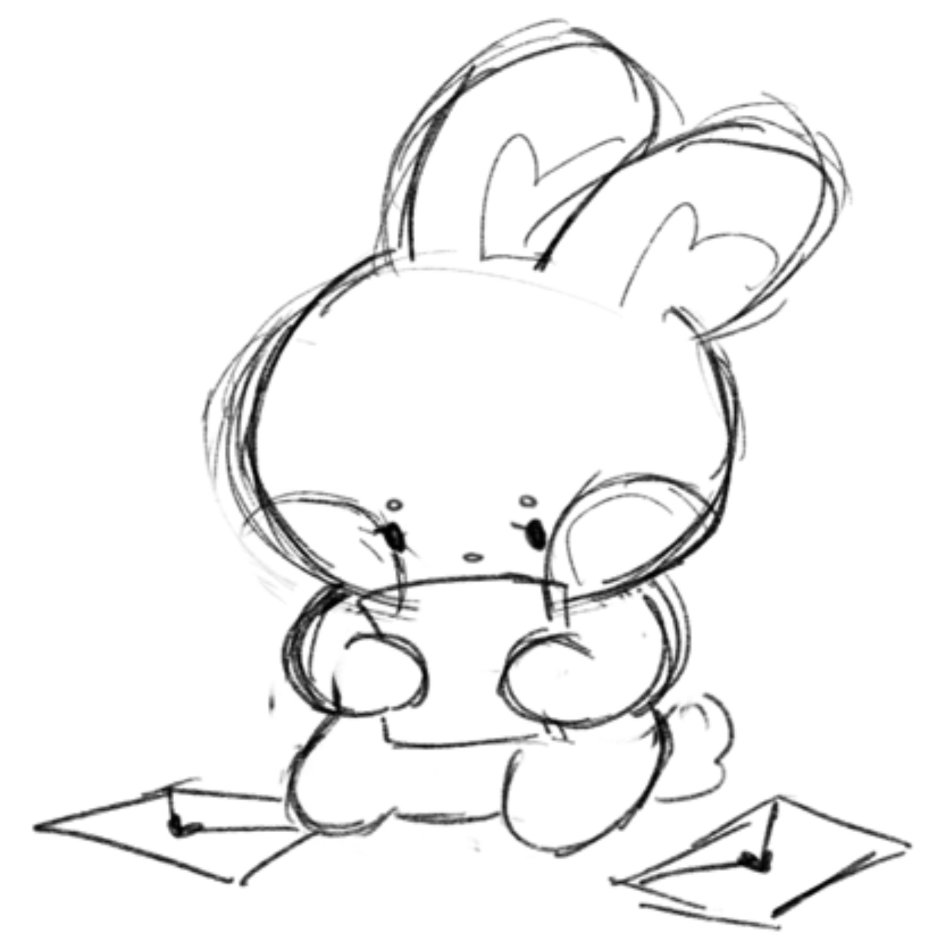
Contact Biko Sketch

FAQ Ube Sketch
Product Asset Final Artwork
Biko & Ube (Die Cut Sticker)
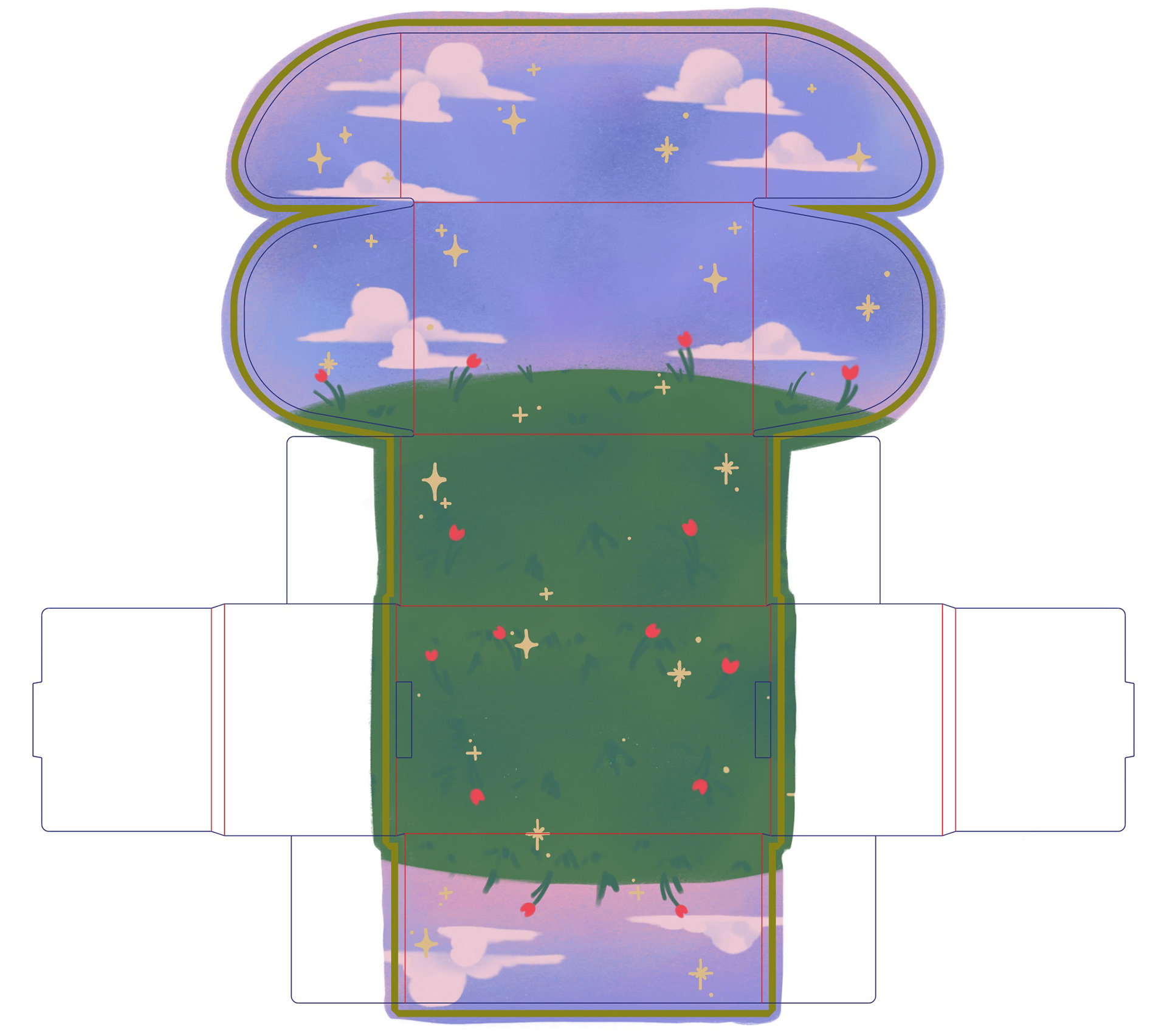
Arka Mailer Box Inside
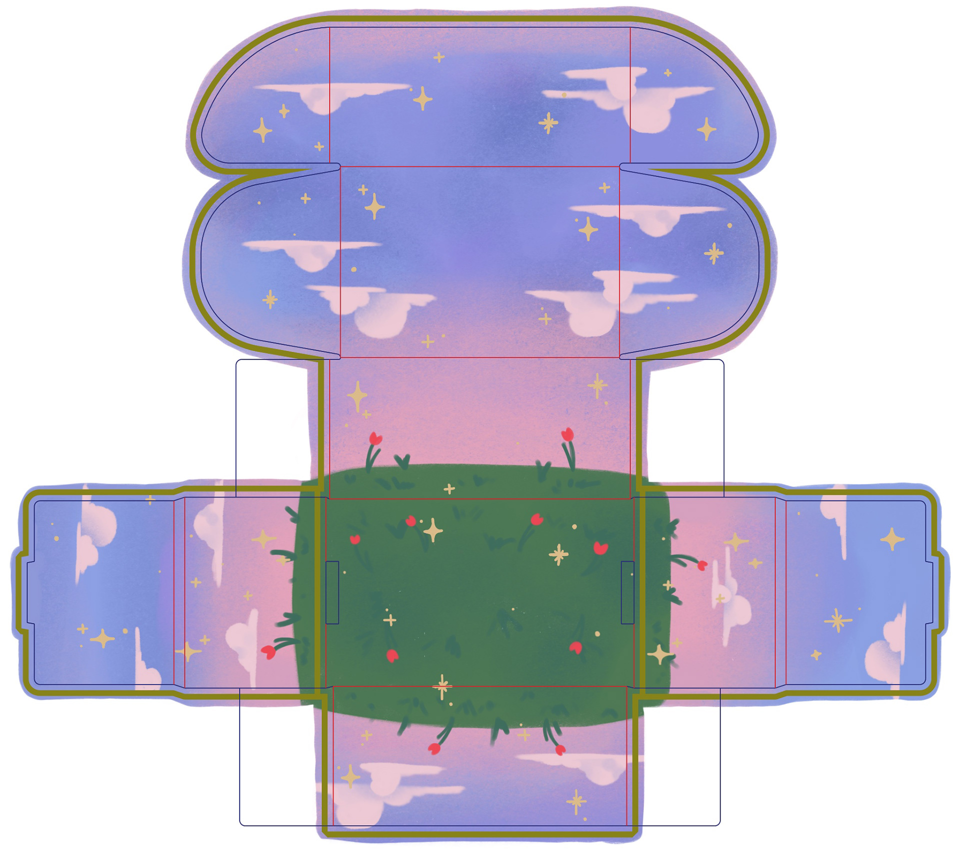
Arka Mailer Box Outside

No Talk Me Angy Front (Acrylic Charm)
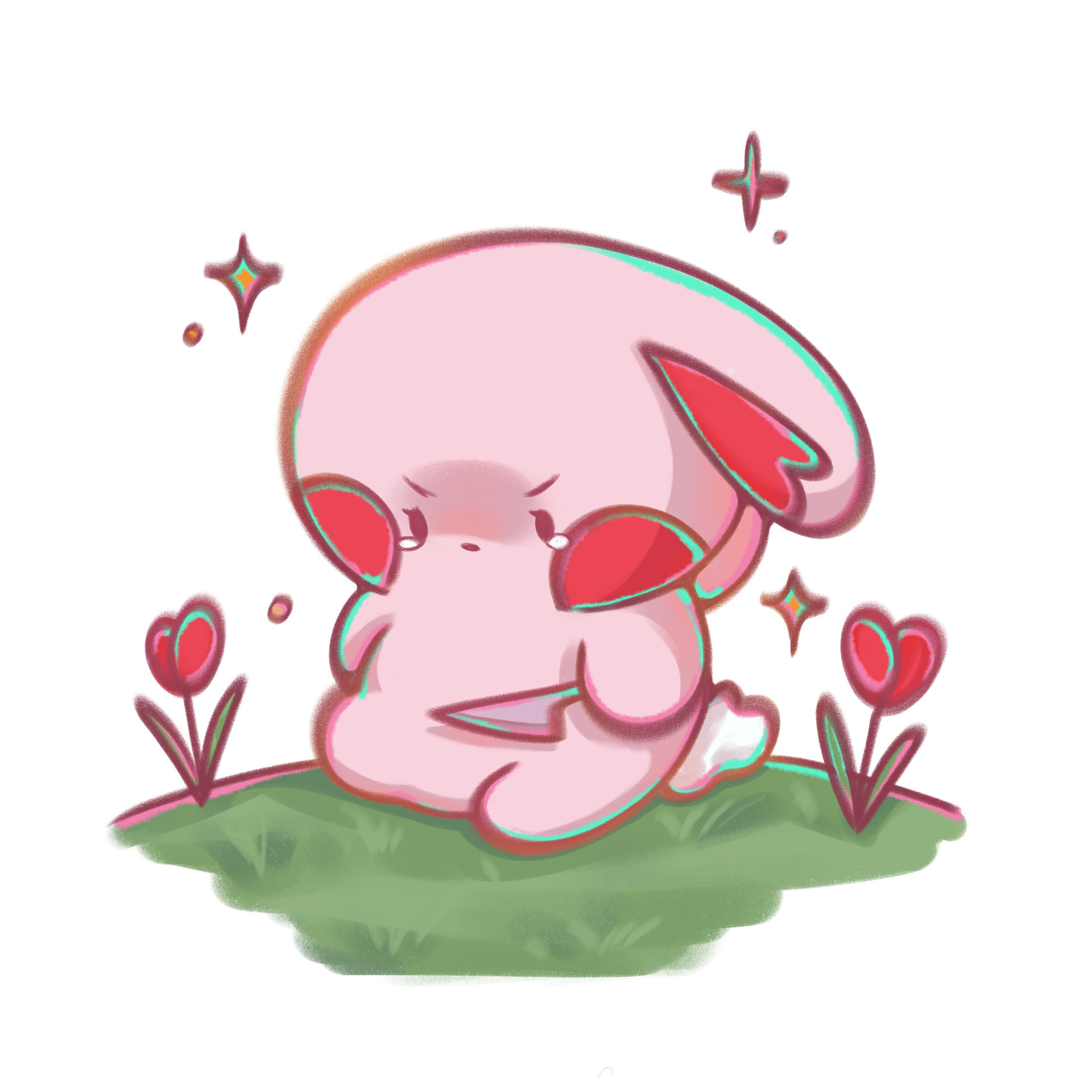
No Talk Me Angy Back (Acrylic Charm)
Mailer Biko (Mailer Box Inside)

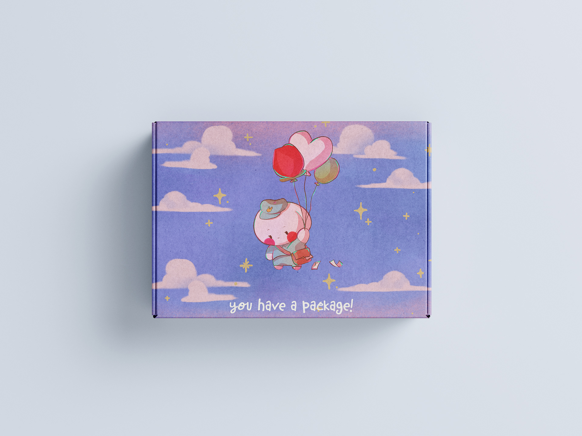
Mailer Biko (Mailer Box Outside)
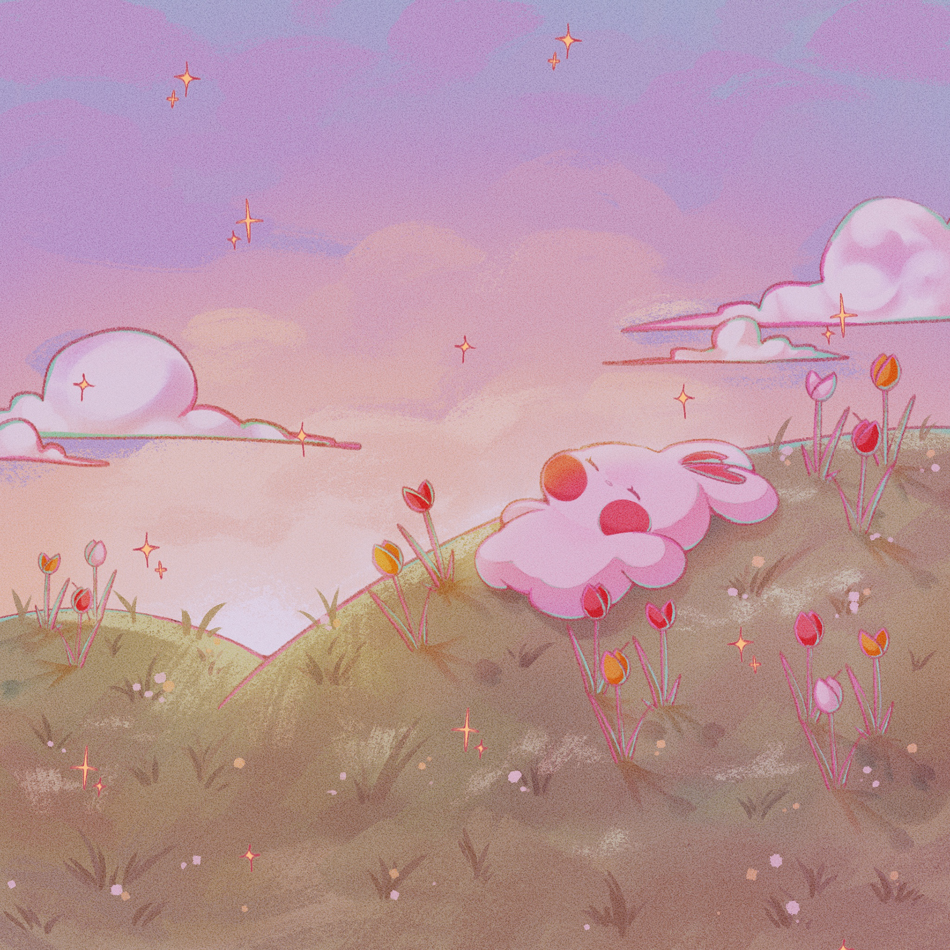
Sleeping Biko (Landing Page & Notebook)
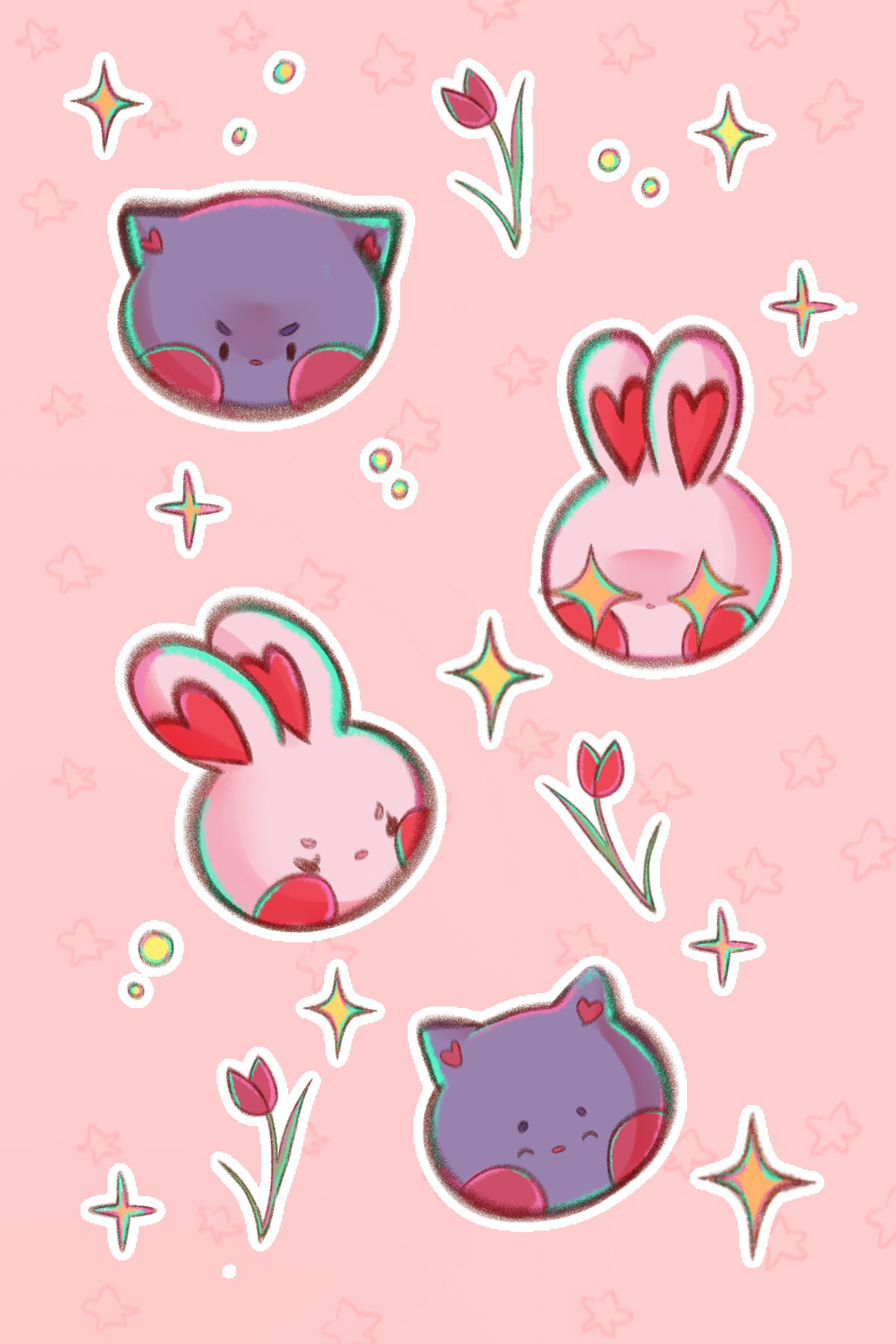
Moody Biko & Ube (Sticker Sheet)
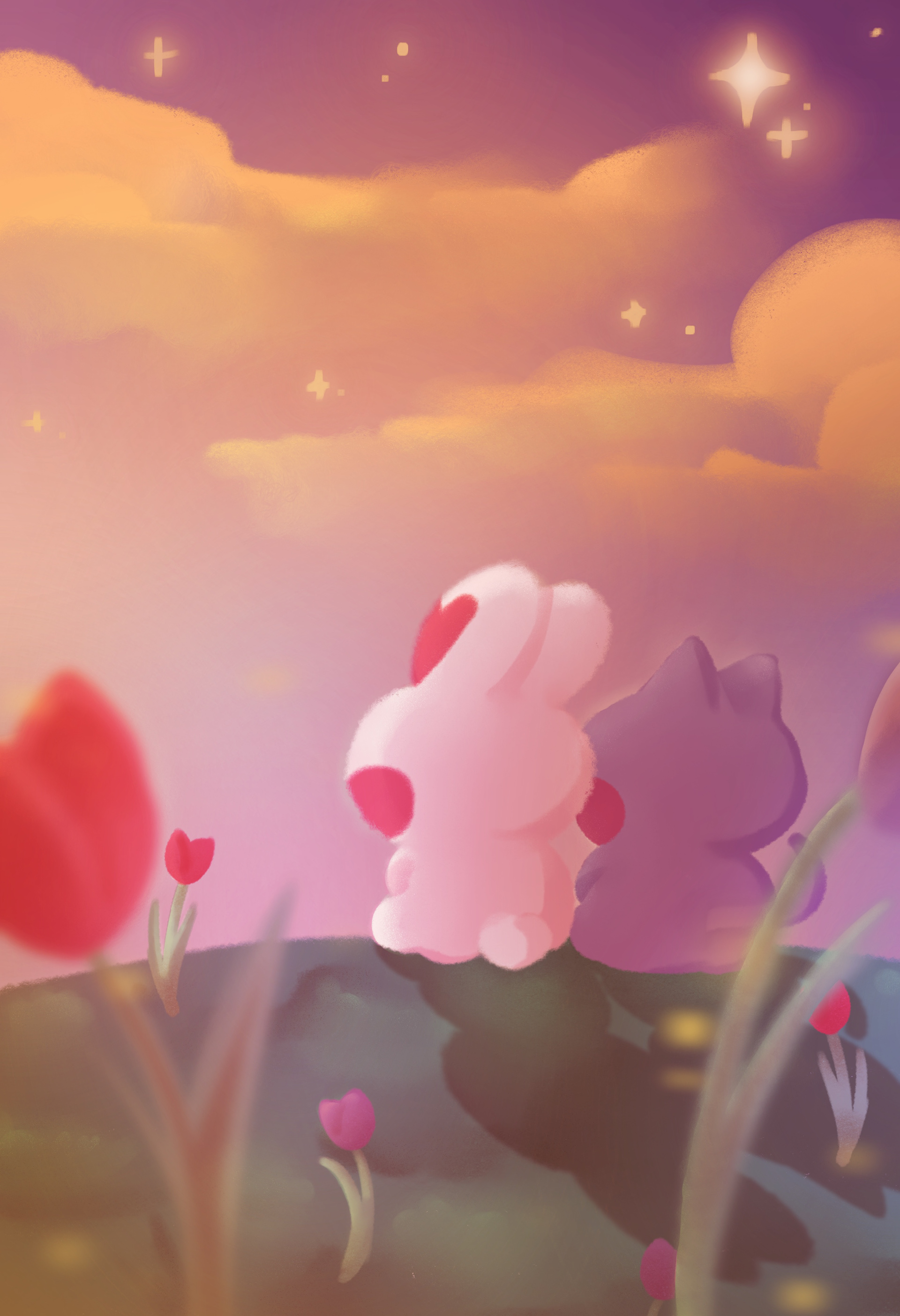
Starry Sunset (Thank You Card)
Contact Biko

FAQ Ube
Final Product & Packaging Deliverables
Here are the product designs in their respective physical forms! Each product with the brand pattern behind it is meant to be sold. The mailer box design has been slightly modified to fit the mockup. Since the notebook is a bonus, I added an emboss effect for the logo on the side of the book and on the top.
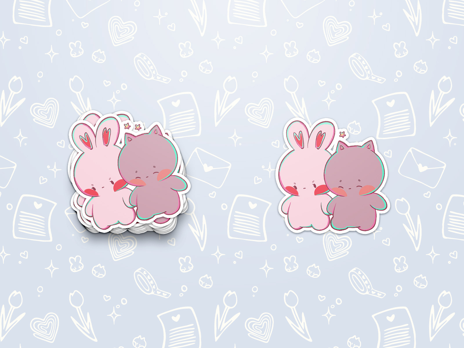
Biko & Ube Die Cut Stickers
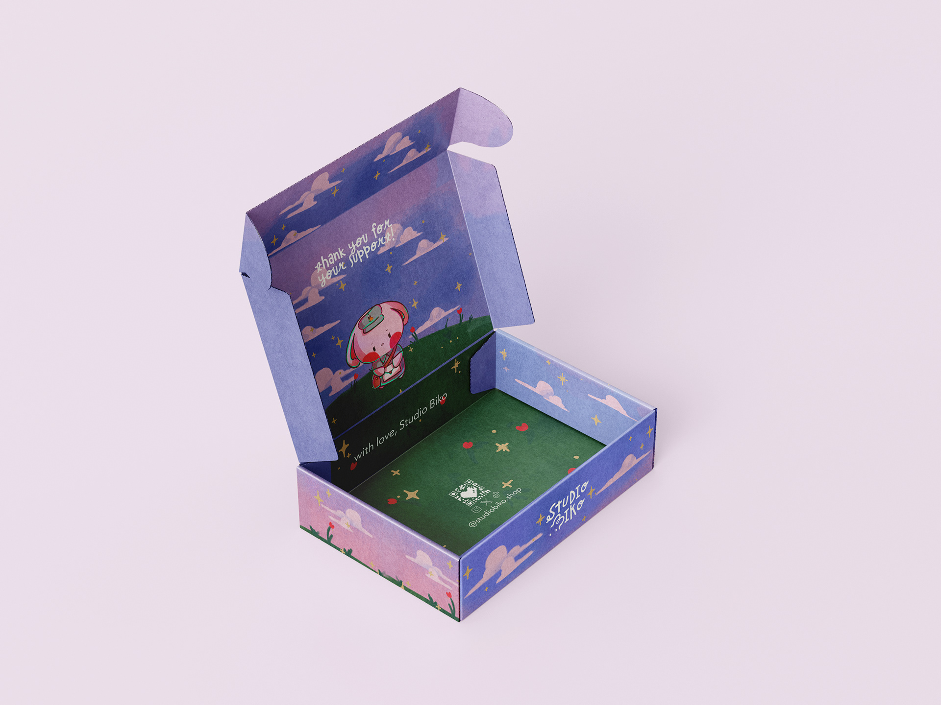
Mailer Box Inside View
Mailer Box Top View
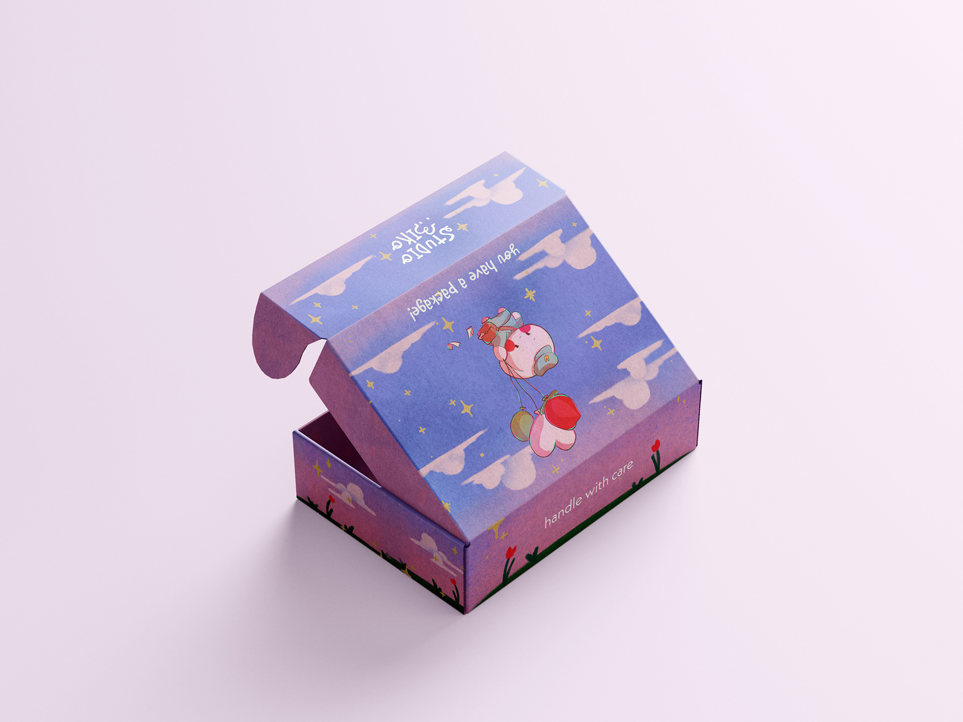
Mailer Box Outside View
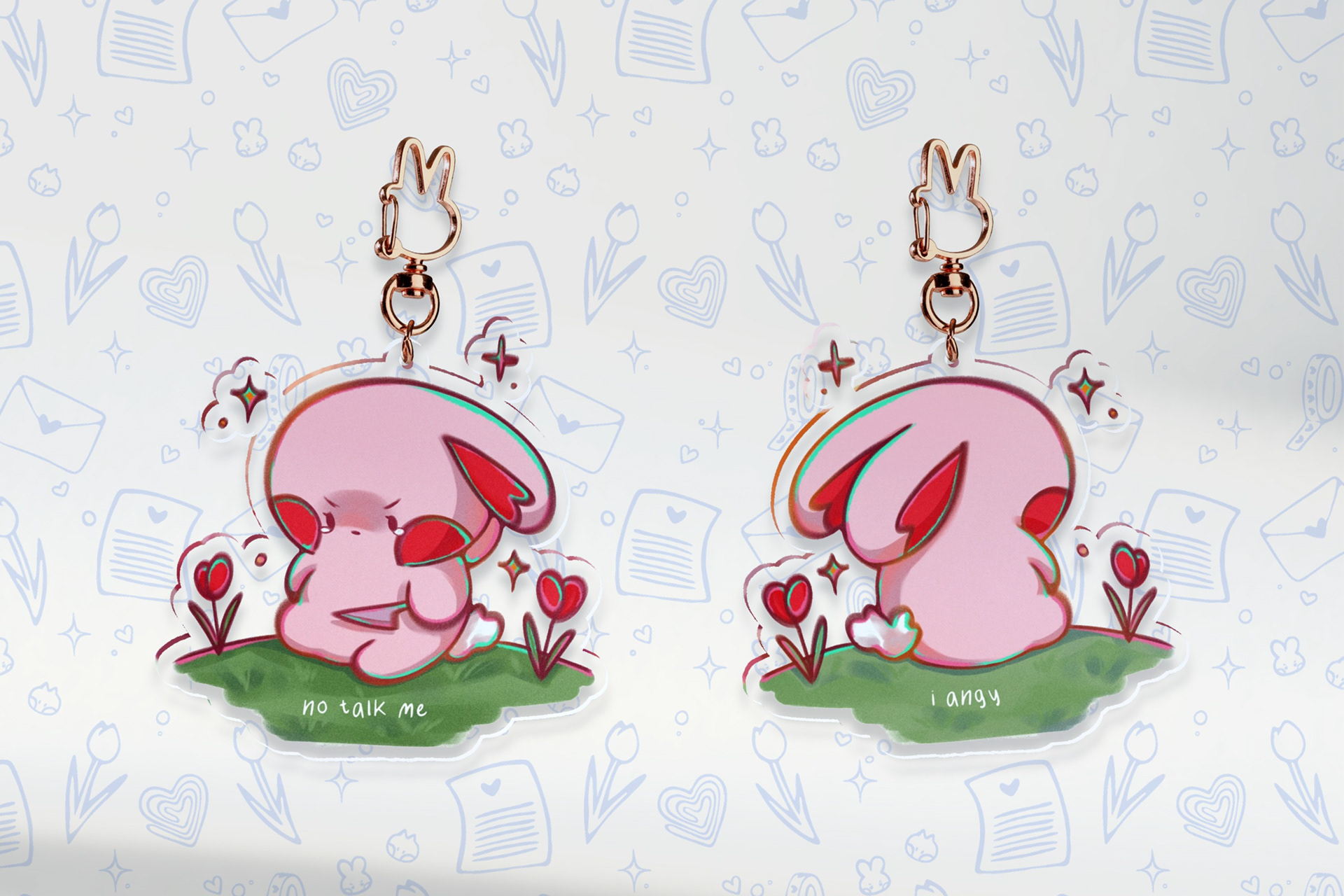
No Talk Me I Angy Acrylic Keychain Front & Back
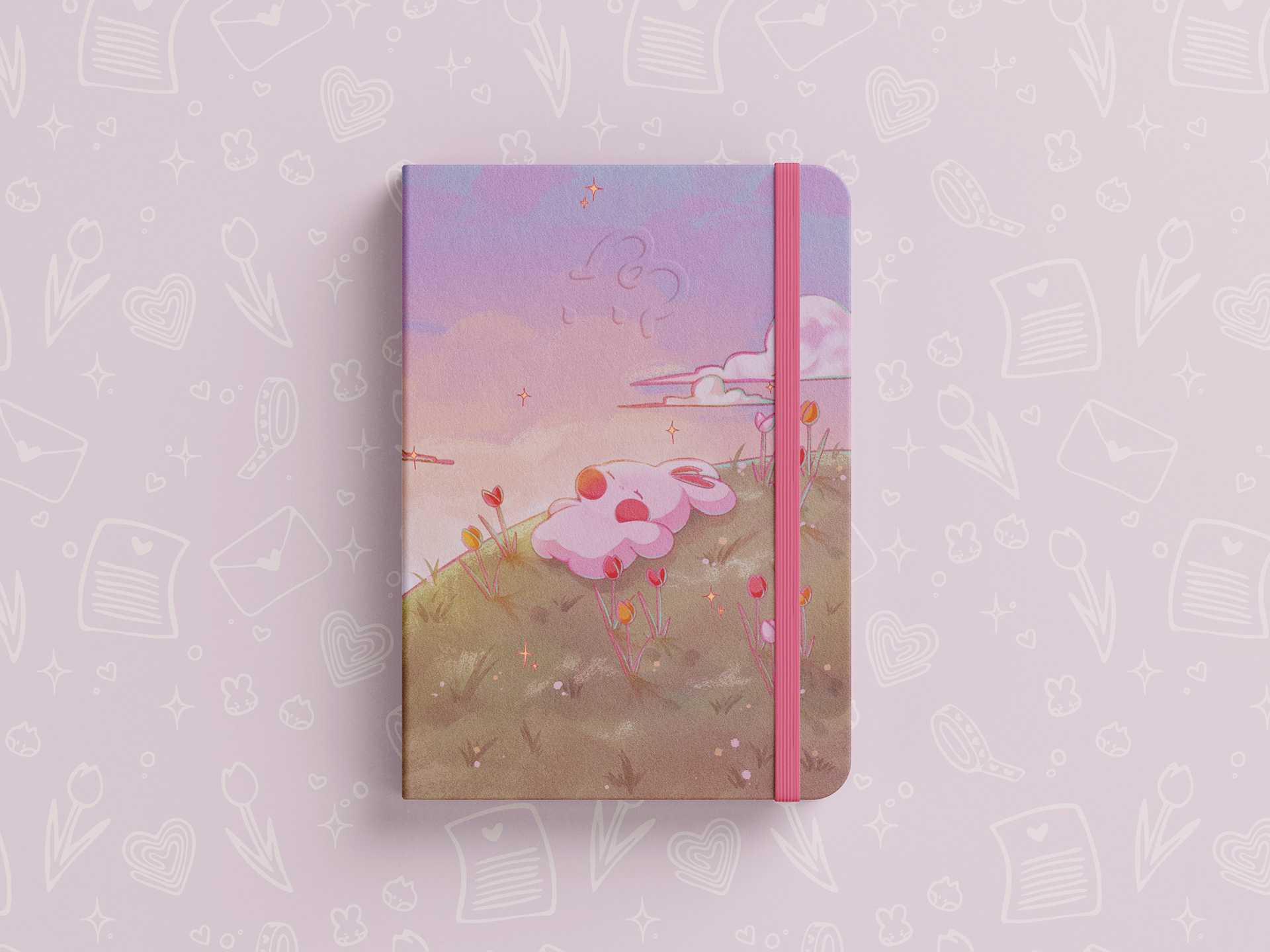
Sleepy Biko Notebook Front
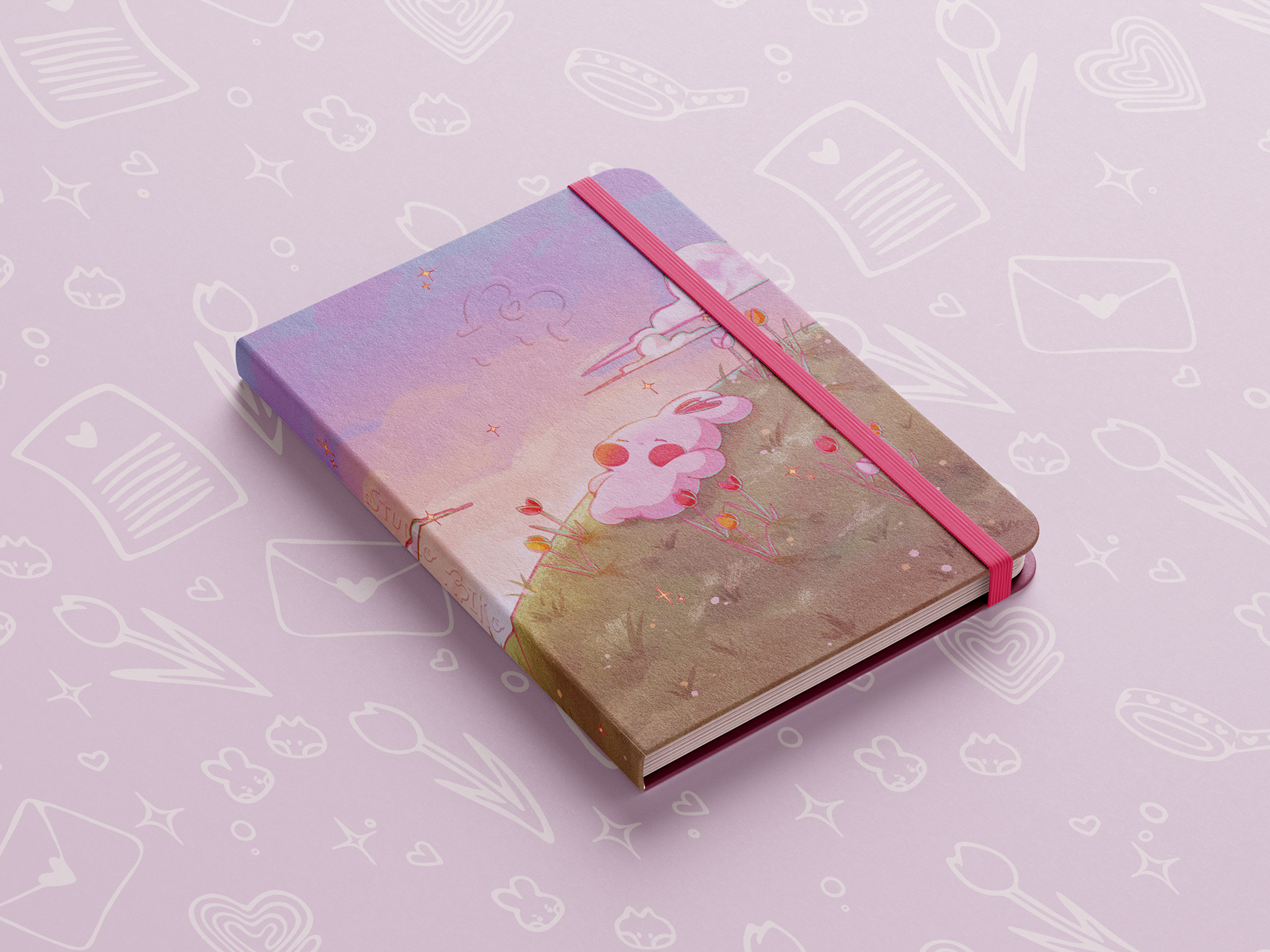
Sleepy Biko Notebook
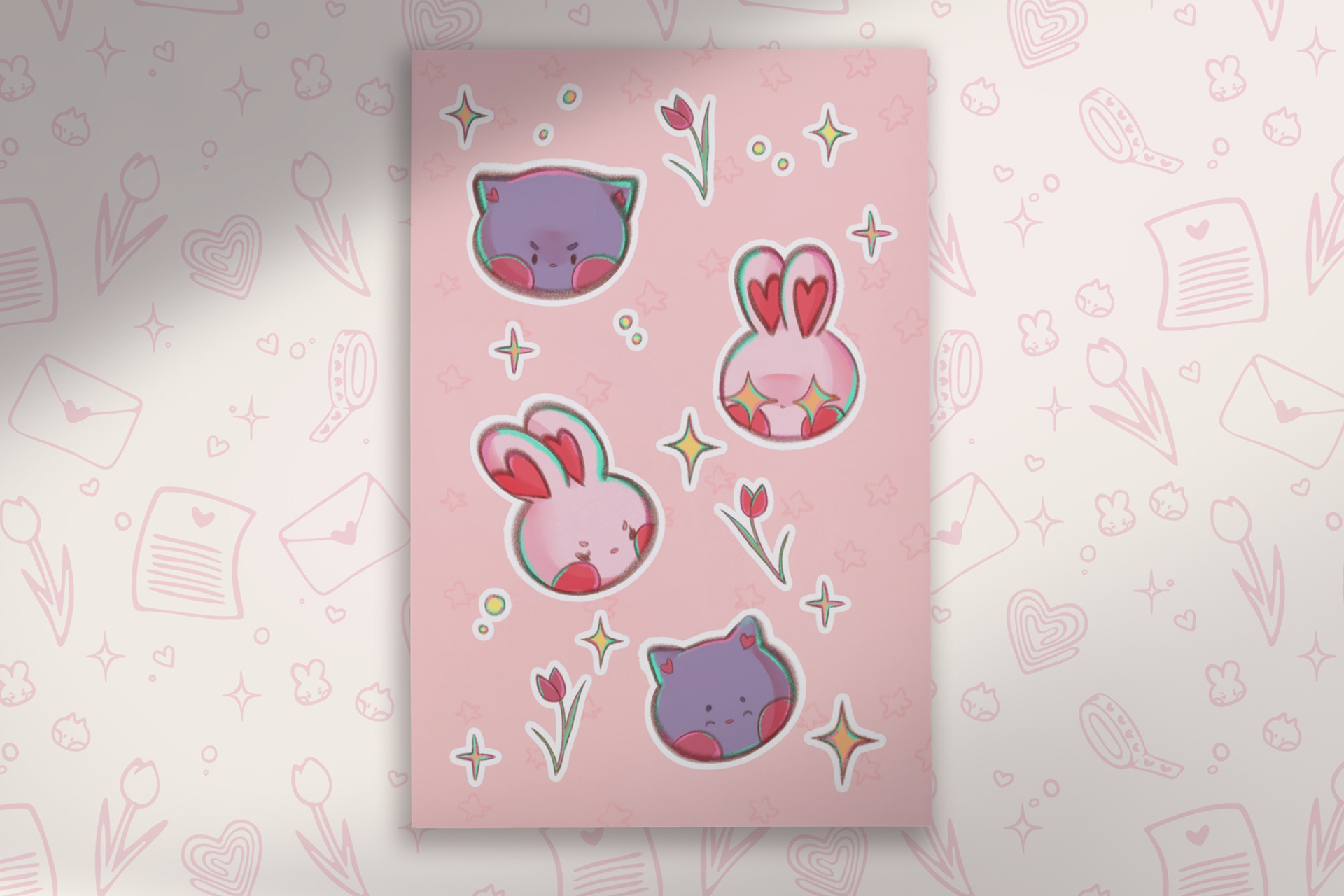
Moody Biko & Ube Sticker Sheet
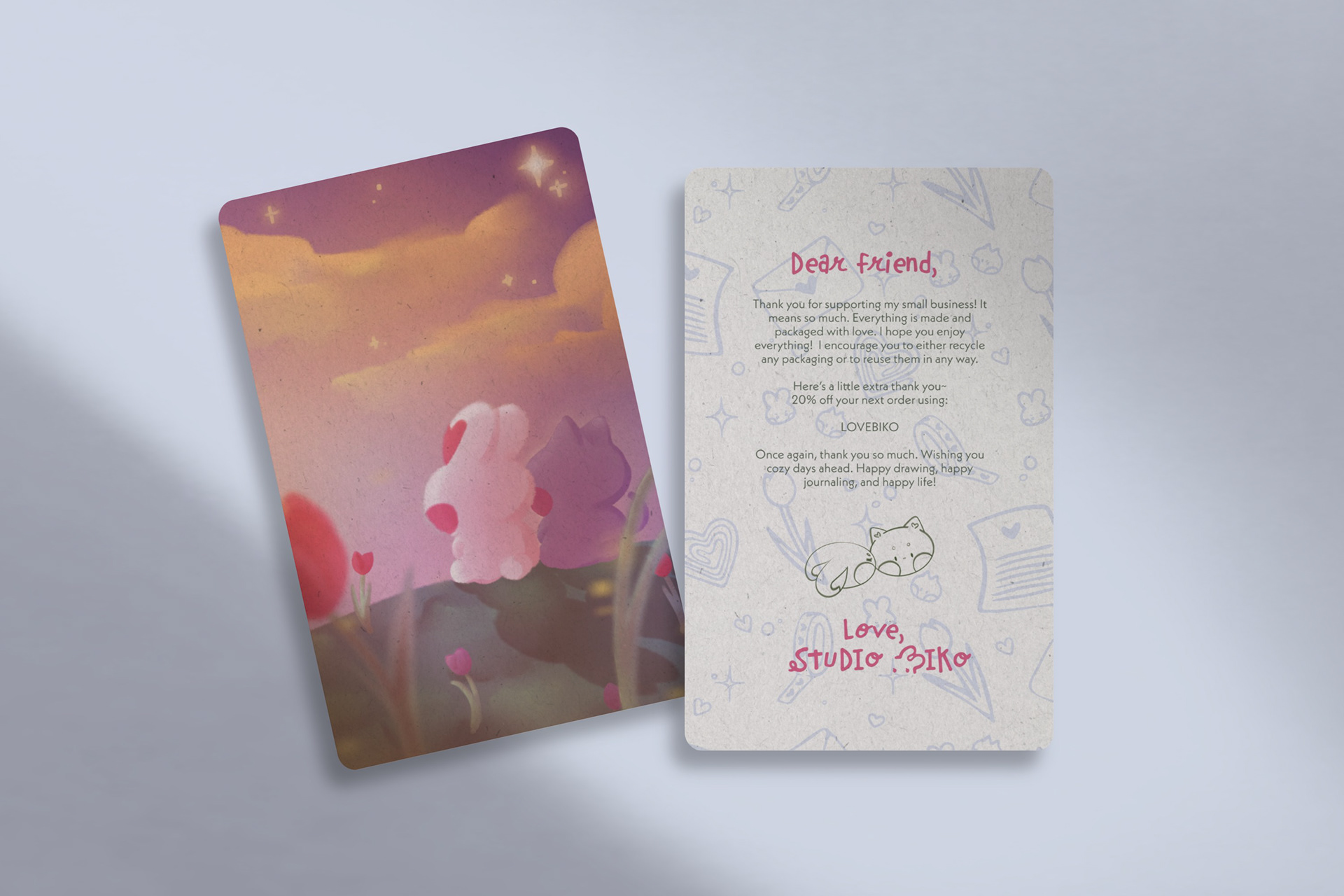
Thank You Card
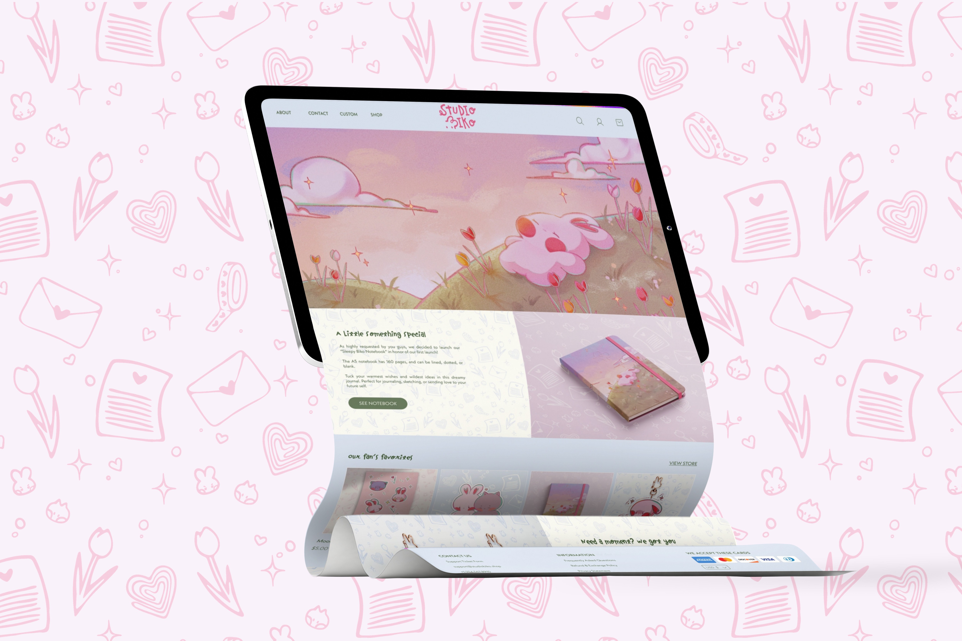
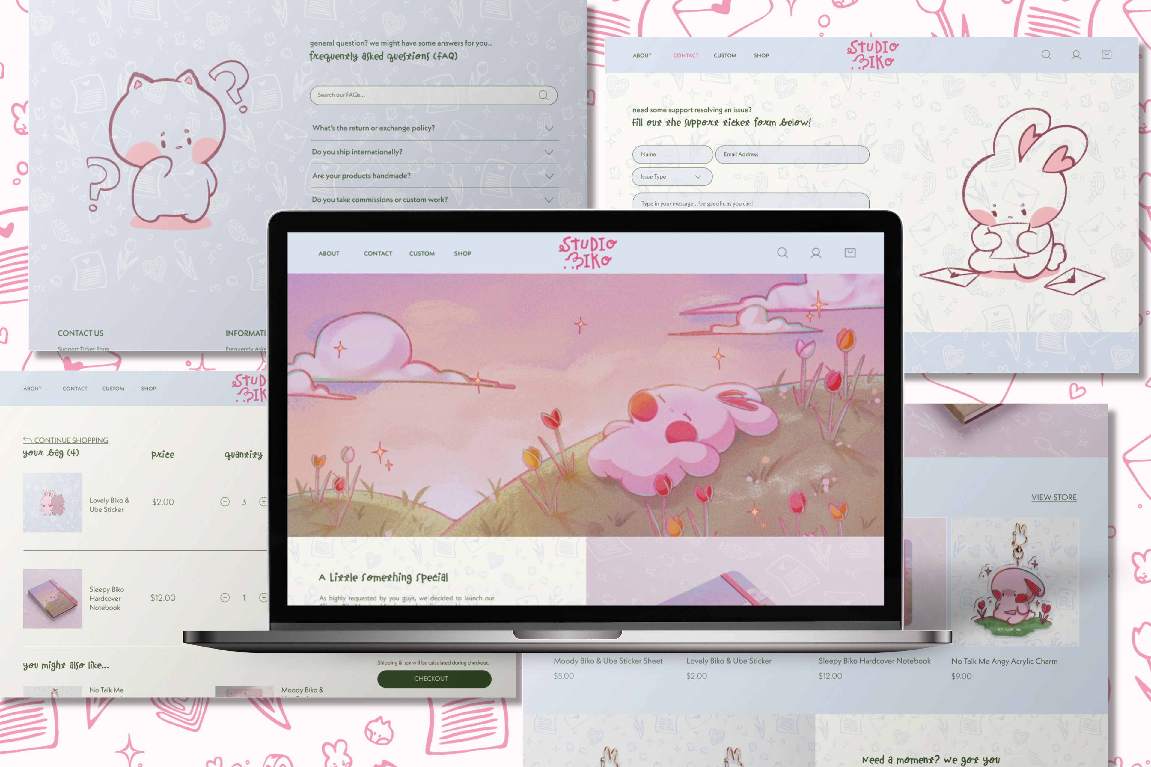
Website Design & Brief User Experience (UX) Process
In relation to the branding class, the goal was to create three high-fidelity pages of our choosing, with an optional prototype. Limited on product designs at the moment, and three pages, no site-map was made - this is not a full case study, however, I considered scalability beyond the three pages. I settled on a home page, contact/FAQ page, and the cart page. To better understand e-commerce patterns in the stationery niche, I looked at several existing websites (e.g. Muji, AstraeaAmour, Uncomfy Co., and others). I analyzed how they structured their homepages, contact and FAQ pages, navigation, and carts/pre-checkout pages, noting best practices for accessibility and user-friendly design.
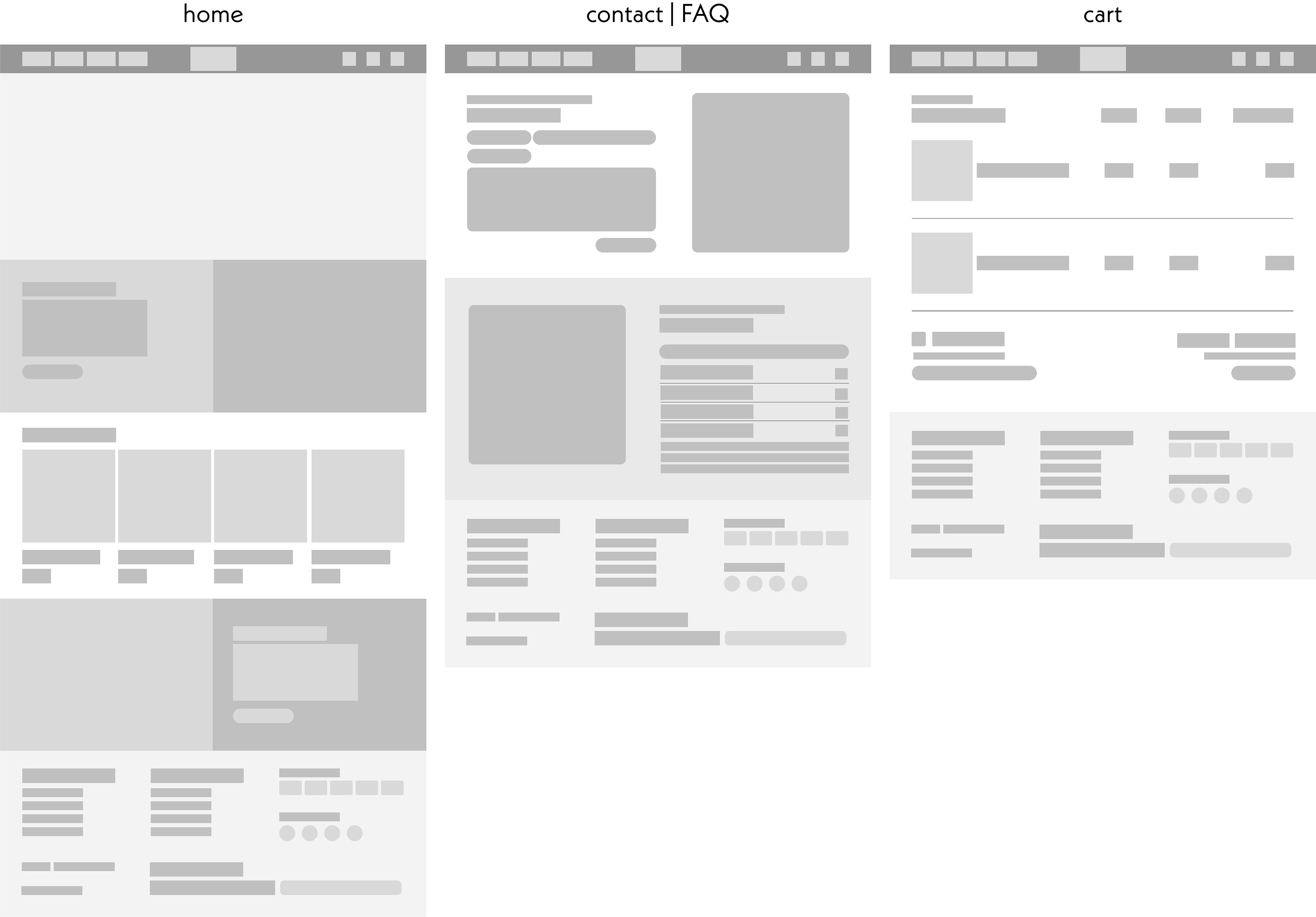
Low-Fidelity Wireframes
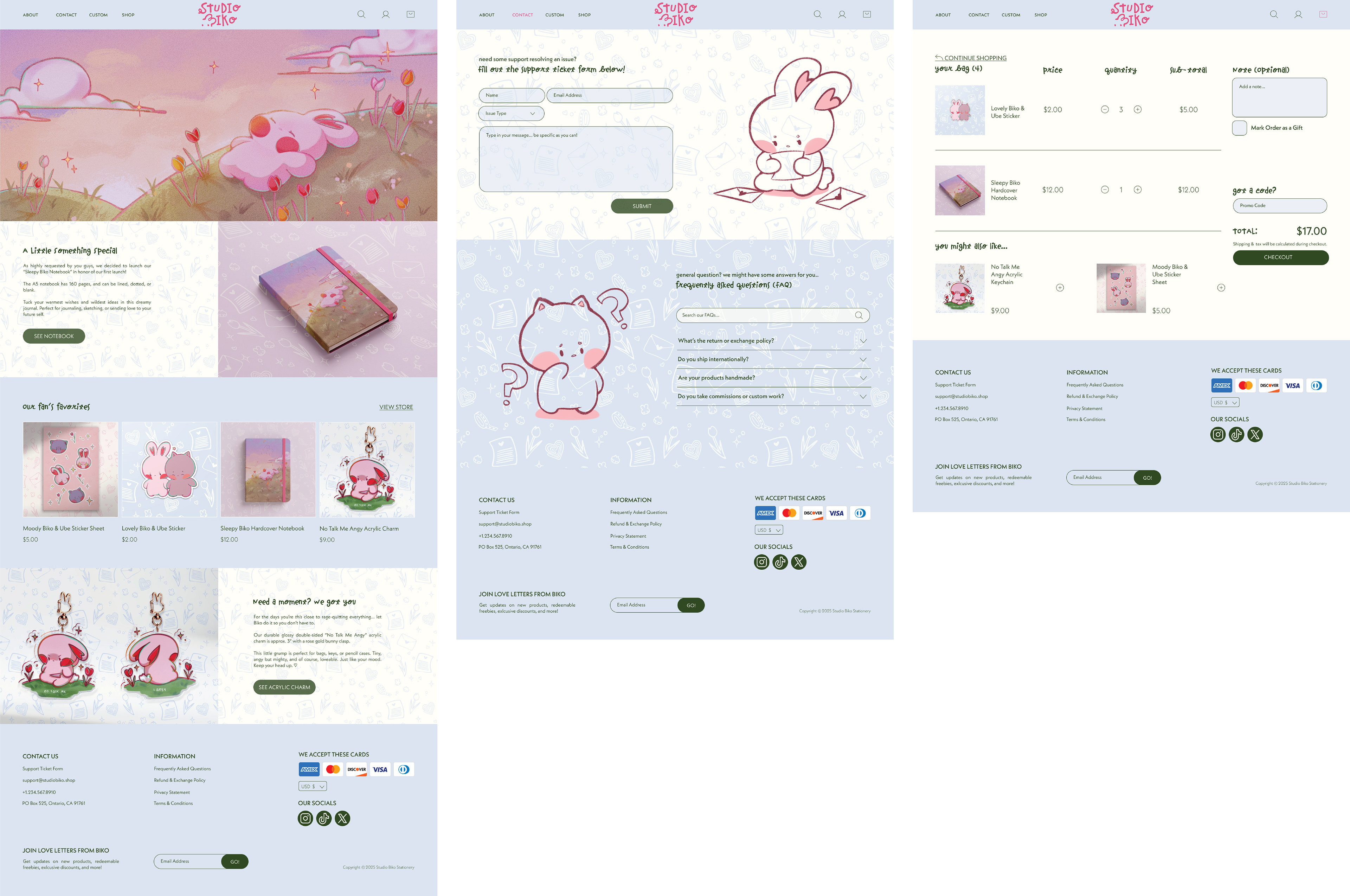
High-Fidelity Wireframes
User Interface (UI) Process & Prototype
Lots of extensive research and an already basic knowledge of HTML/CSS aided creating components for the prototype. After finalizing the wireframes, I designed the high-fidelity mockups in Figma, focusing on a soft, playful aesthetic that reflects the personality of Studio Biko. I created reusable components (buttons, nav bars, cards) and organized them in a design system for consistency. The prototype includes interactive elements to simulate homepage browsing, navigating through contact and FAQs, and starting checkout (with items as placeholders). I prioritized clarity, visual hierarchy, and an easy-to-use layout that feels cozy and welcoming!
Macbook Mockup