designed for an intro to graphic design class
task: choose, research, and create a logo branding for a small restaurant that is not a chain. I chose k-towne88, a small Korean fusion restaurant located in Rancho Cucamonga
research is listed below graphics

Name: k-towne88
Target audience: People craving authentic Korean street and traditional food, but with a twist on American/Mexican/other Asian street fusion. Those who aren't looking much at the budget are paying attention to the experience this place provides through its food and services. Bonus points if you're craving Korean street food in Inland Empire/Rancho Cucamonga.
Persona: A 20-year-old Isha Soto is craving something different and is looking to treat herself after a day
of working hard at her part-time job. As a student, she would normally focus on the budget, but
today was the day to treat herself to something nice. She loves food and is not picky with her choices.
Location: 10455 Foothill Blvd, Suite 101, Rancho Cucamonga, CA 91730
Competitors: bigger Korean BBQ chains (Gen, UBBQ, etc), Pelicana Chicken (a new chain that started in Rancho, specializing in Korean fried chicken with some traditional food as sides), bb.q chicken (Korean fried chicken chain), Madbun (Asian fusion focus on burgers or sandwiches located in Haven City), ON+ON (healthy bibimbap inspired food bowls located in Haven City)
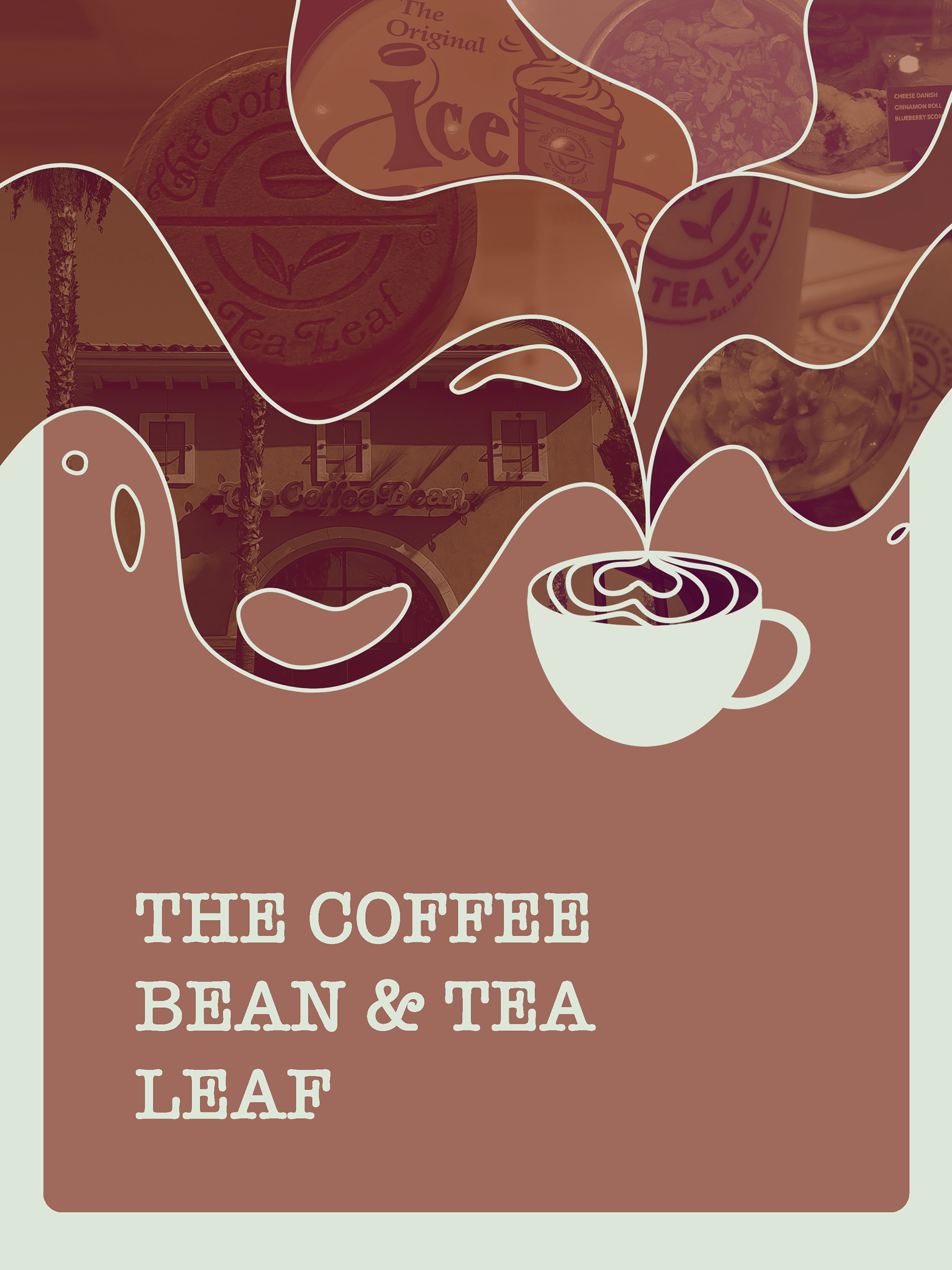
Unique qualities: It is a Korean-owned small family business located in a plaza that doesn't have any competitors (although Haven City's plaza is located almost across the street). The plaza only contains a Coffee Bean & Tea Leaf, Booklynz Pizza, Koyla Indian, and several nonfood businesses like a salon, a kickboxing gym, and a real estate/insurance company. The plaza is also located on the corner of two of the more busy streets in the city, Haven and Foothill. The Verano apartment complex is also located in the plaza so there is easy access for the people that live there (I used to live here haha), which are mostly very small families (at most two kids avg per family) and couples in their late 20s to 30s. Because it is located in a plaza like this, there is a really good sense of community and family outside of the apartment homes. Moving on to their food, they have a lot of choices; which kind of compromises the idea of quality over quantity when it comes to restaurants, especially as a small family business, but as someone who's tried every item on the menu over the years, I can attest to their quality and plan to bring it out through the branding. They have food items ranging from Vietnamese banh mi, a fusion of Korean and Mexican bulgogi fries or tacos, Pho, Korean BBQ, soon tofu, bibimbap, a handful of sides, etc. The inside of the building also has a fun vibe to it; when you walk in and turn left there's a wall that's hand doodled depicting a location, the colors are mainly black, white, and a type of falu red, and the floors are checkered black and white, and there is an overall vibe that's familiar to Asian American families, which only gets enhanced if you've stayed in this plaza for so long. Either K-pop or sports always play on the TVs.
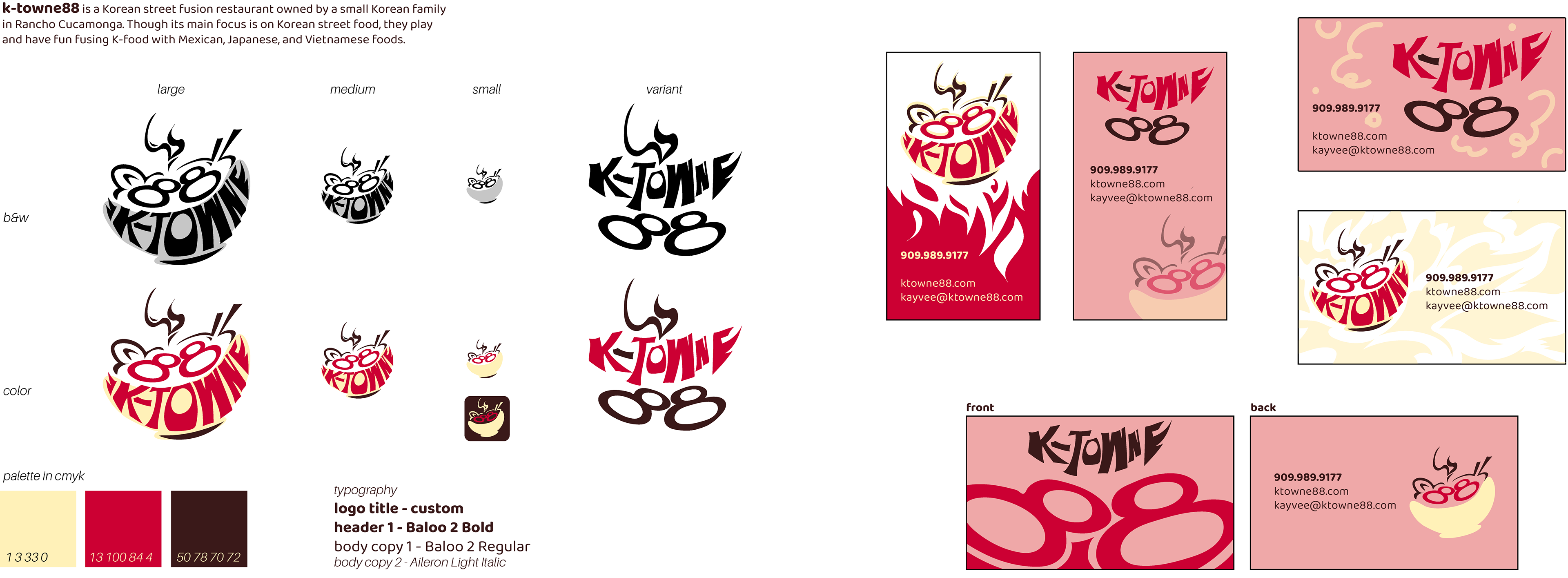
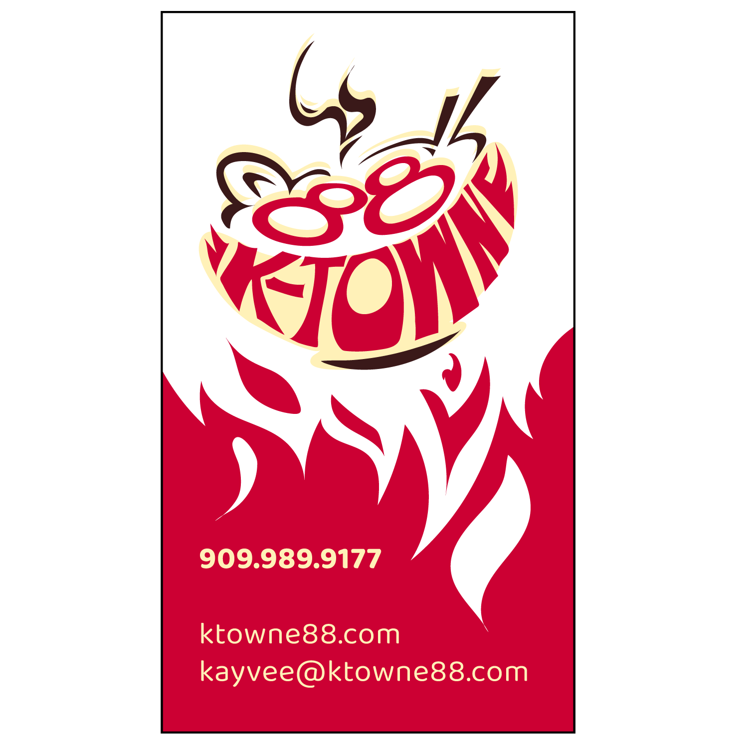
Design objectives: professional (they have so many food items and at a glance of the logo would help the idea that they put quality and care into each food item), clean/somewhat simple (homage to their original design and the simplicity of it being family-owned), the falu red that they use on the inside, a small quality that resonates with a food truck to capture that street essence, and a retro/y2k style that pairs well with the modernism and vibe inside the restaurant
Adjectives: Yummy and delightful
Current logo: on the website: "KTOWNE88" in all caps in a typeface almost exact to Dreamland Regular, physically on the store its "K-TOWNE88"
Target audience: People craving authentic Korean street and traditional food, but with a twist on American/Mexican/other Asian street fusion. Those who aren't looking much at the budget are paying attention to the experience this place provides through its food and services. Bonus points if you're craving Korean street food in Inland Empire/Rancho Cucamonga.
Persona: A 20-year-old Isha Soto is craving something different and is looking to treat herself after a day
of working hard at her part-time job. As a student, she would normally focus on the budget, but
today was the day to treat herself to something nice. She loves food and is not picky with her choices.
Location: 10455 Foothill Blvd, Suite 101, Rancho Cucamonga, CA 91730
Competitors: bigger Korean BBQ chains (Gen, UBBQ, etc), Pelicana Chicken (a new chain that started in Rancho, specializing in Korean fried chicken with some traditional food as sides), bb.q chicken (Korean fried chicken chain), Madbun (Asian fusion focus on burgers or sandwiches located in Haven City), ON+ON (healthy bibimbap inspired food bowls located in Haven City)
Unique qualities: It is a Korean-owned small family business located in a plaza that doesn't have any competitors (although Haven City's plaza is located almost across the street). The plaza only contains a Coffee Bean & Tea Leaf, Booklynz Pizza, Koyla Indian, and several nonfood businesses like a salon, a kickboxing gym, and a real estate/insurance company. The plaza is also located on the corner of two of the more busy streets in the city, Haven and Foothill. The Verano apartment complex is also located in the plaza so there is easy access for the people that live there (I used to live here haha), which are mostly very small families (at most two kids avg per family) and couples in their late 20s to 30s. Because it is located in a plaza like this, there is a really good sense of community and family outside of the apartment homes. Moving on to their food, they have a lot of choices; which kind of compromises the idea of quality over quantity when it comes to restaurants, especially as a small family business, but as someone who's tried every item on the menu over the years, I can attest to their quality and plan to bring it out through the branding. They have food items ranging from Vietnamese banh mi, a fusion of Korean and Mexican bulgogi fries or tacos, Pho, Korean BBQ, soon tofu, bibimbap, a handful of sides, etc. The inside of the building also has a fun vibe to it; when you walk in and turn left there's a wall that's hand doodled depicting a location, the colors are mainly black, white, and a type of falu red, and the floors are checkered black and white, and there is an overall vibe that's familiar to Asian American families, which only gets enhanced if you've stayed in this plaza for so long. Either K-pop or sports always play on the TVs.
Design objectives: professional (they have so many food items and at a glance of the logo would help the idea that they put quality and care into each food item), clean/somewhat simple (homage to their original design and the simplicity of it being family-owned), the falu red that they use on the inside, a small quality that resonates with a food truck to capture that street essence, and a retro/y2k style that pairs well with the modernism and vibe inside the restaurant
Adjectives: Yummy and delightful
Current logo: on the website: "KTOWNE88" in all caps in a typeface almost exact to Dreamland Regular, physically on the store its "K-TOWNE88"